

Flowscape Analytics & Admin Portal
Redesigning a workplace analytics platform to help facility managers make data-driven decisions about office space utilization. I led the redesign of core analytics workflows in close collaboration with engineers and stakeholders.
Portfolio Overview
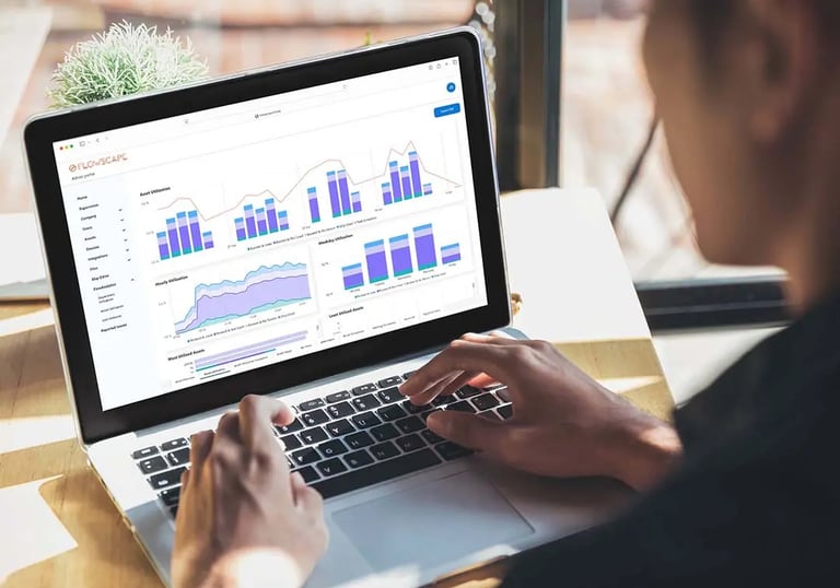
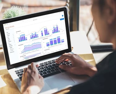
Flowscape is a workplace management solution with an integrated analytics platform that helps facility managers understand how office spaces are being used. Through stakeholder interviews and reviews of the existing analytics dashboard, it became clear that the admin portal was cluttered and difficult to navigate, making it hard for users to surface key insights and reliably apply and reuse filtering and view configurations. My goal was to redesign the analytics dashboard and admin portal to highlight the most important information, reduce cognitive load, and help facility managers make faster, more confident decisions about space optimization.
The Challenge
Facility managers were struggling to confidently use the analytics platform to support day-to-day and strategic decisions:
Information overload
Too many metrics were displayed without a clear hierarchy, making it difficult to identify what required attention
Difficulty finding actionable insights
Key trends were buried in the data, slowing decision-making and reducing trust in the dashboard
Complex configuration flows
Filtering and view setup required unnecessary effort, often forcing users to rely on training or support
Research & Discovery
I conducted 7 user interviews with facility managers across different industries to understand their workflows and pain points. Key findings included:
Usage patterns varied significantly
3 of 7 users were power users who explored and used most available features, while the remaining users relied on just 2–3 dashboards and navigated the portal through trial and error rather than a clear mental model.
Core metrics mattered most
Most users focused on a small set of key metrics and trends, rarely engaging with the full range of available data.
Low confidence in filtering and views
Users struggled to reliably recreate and reuse filtering and view configurations, which made it harder to compare data over time.
Export workflows were frustrating
Exporting data was slow and unclear, interrupting workflows and reducing trust in the system when users needed to share insights.
The Solutions
Based on user research, I am redesigning the analytics dashboard to support both power users and less experienced users by focusing on clarity, hierarchy, and repeatability.
Impact & Learnings
As this project is ongoing, impact has been assessed through usability testing, stakeholder feedback, and internal reviews.
Clearer navigation
Users located key metrics more efficiently than in the previous dashboard.
More confidence in filters and views
Users felt more confident applying and reusing views for repeatable analysis.
Lower cognitive load
Improved hierarchy reduced the time and mental effort needed to find relevant insights.
Key Learnings
This project reinforced the importance of grounding design decisions in real user workflows. By prioritizing the 3–4 metrics facility managers relied on most, we were able to simplify the analytics experience.
Interviews indicated that a customizable dashboard could better support different user needs, from hands-on facility managers to executives seeking high-level trends, which will be validated in later iterations.


Next case study
© 2026 UX Portfolio. All rights reserved.
Designed and built with care in Stockholm.
UX designer in Stockholm creating clear, thoughtful digital experiences through research-driven design.
Portfolio
Navigation