
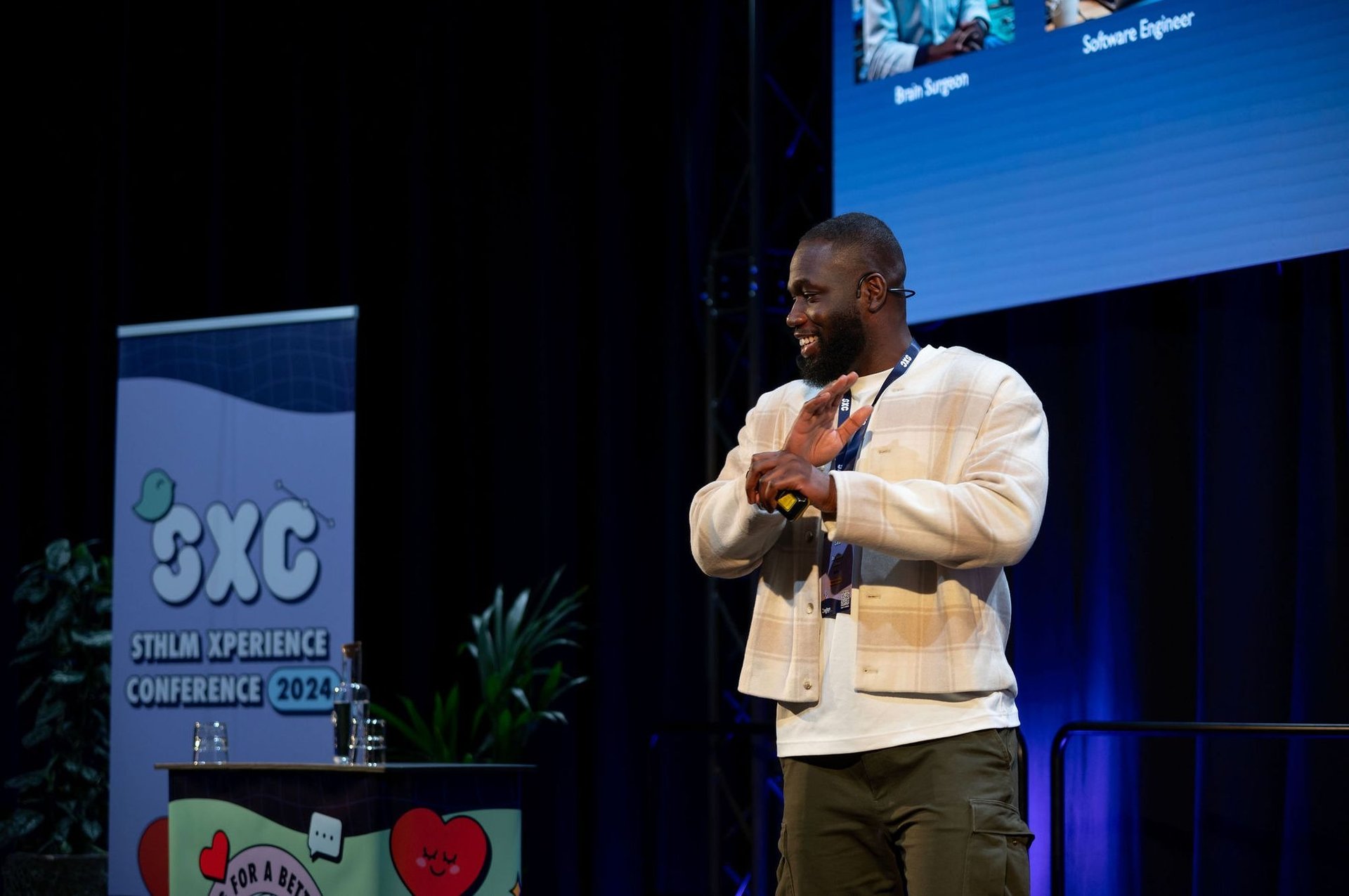
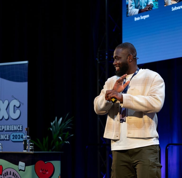
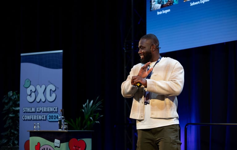
Stockholm Xperience Conference
Our team developed a web app to improve networking and engagement at the Stockholm Xperience Conference, a hybrid event for UX designers. Applying User-Centered Design principles, I contributed to research, prototyping, and testing that uncovered key insights for creating a seamless user experience.
Stockholm Xperience Conference
Project - 2025
Challange
The main challenges were reaching the right users and collecting enough data, as well as keeping a clear direction under time constraints while balancing exploration with simple, testable prototypes.
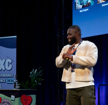
STHLM Xperience Conference is an annual event for UX designers in Stockholm. The organizers wanted to improve the attendee experience by introducing a web-based app that could be used before, during, and after the event without requiring downloads. Our goal was to design a smooth, branded, and engaging solution for both local and remote participants.
Role
UX & Product Designer, in collaboration with 3 teammates
Scope
9 weeks (hybrid), course project at Nackademin
Process
Research, Synthesis & personas, Ideation (HMW, design studio), Low- and hi-fi prototyping, Usability and A/B testing, Iteration and delivery
Tools
Figma, Miro, Google Forms, Optimal Workshop, ChatGPT (for early ideation)
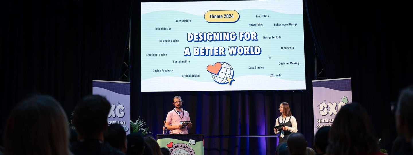
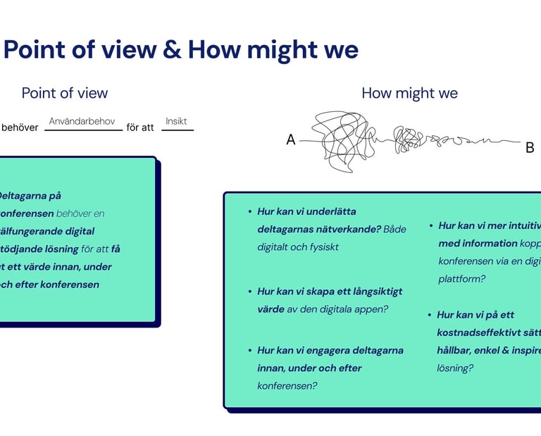
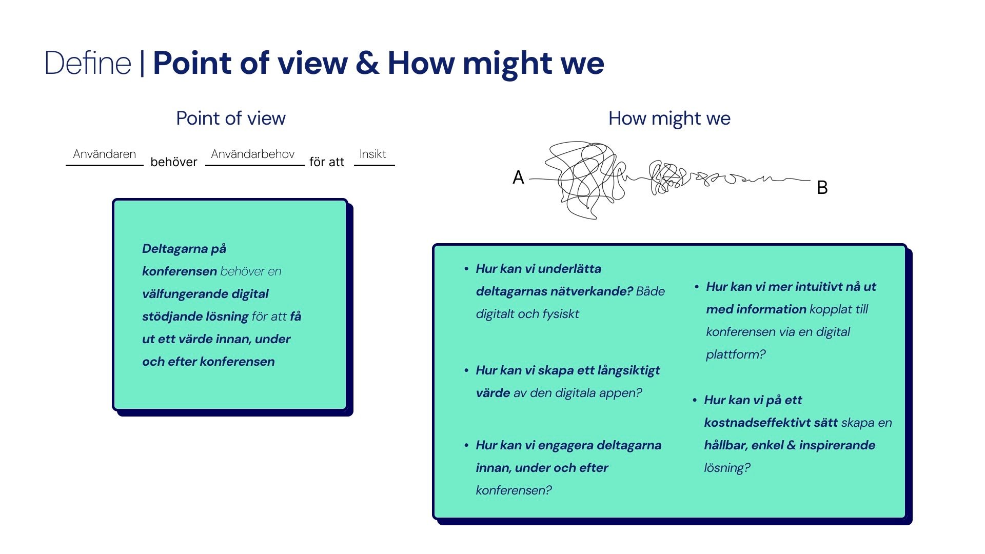
How might we create a web app that enhances networking, increases engagement, and makes the conference experience seamless for all participants?
Stockholm Xperience Conference
Background of the project
STHLM Xperience Conference is an annual event for UX designers held in Stockholm. The organizers wanted to enhance the attendee experience by creating a web-based app that could be used before, during, and after the event without requiring any downloads. The goal was to deliver a smooth, branded, and engaging experience for both local and remote participants. We used the Design Thinking process as our framework for the project.
My Role
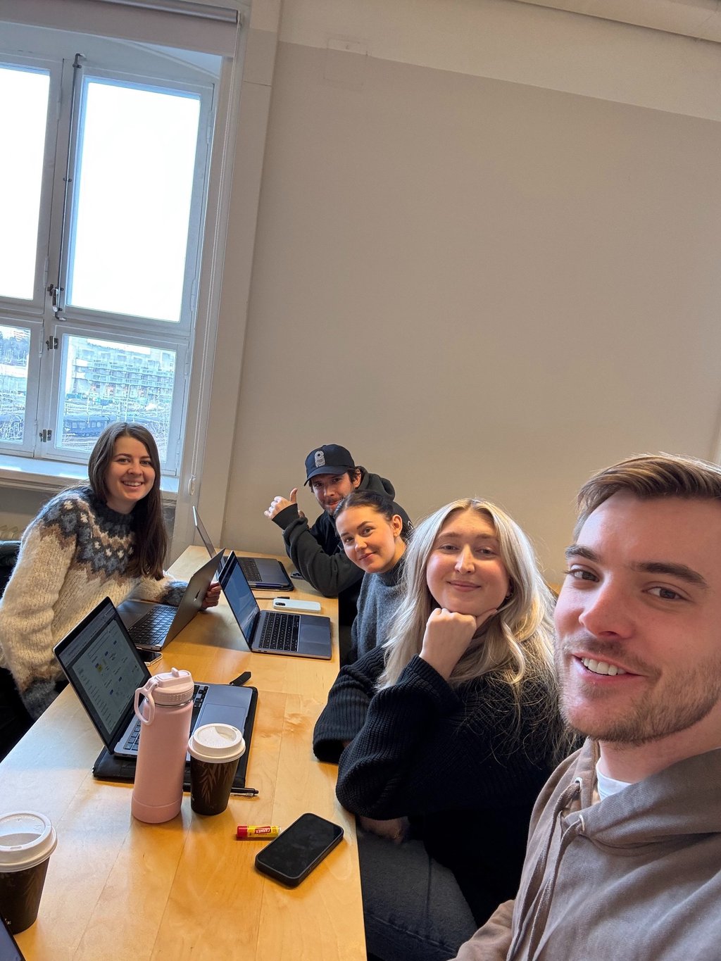
I was involved in the entire Design Thinking process, including user research, persona development, and prototyping in Figma. For the final high-fidelity prototype, our group split into two teams. I worked with a team of three on a gamification version while two teammates developed a different concept. I also participated in usability and A/B testing to refine the app based on user feedback.
Timeline
The project timeline spanned nine weeks, starting with research during weeks one and two, which included stakeholder interviews, surveys, and market analysis. In weeks three and four, we focused on ideation and concept development. Prototyping, both low- and high-fidelity, took place in weeks five and six. During weeks seven and eight, we conducted usability and A/B testing to gather user feedback. Finally, in week nine, we made the last refinements before presenting the final solution.
Tools & Methods
We used Miro for brainstorming and user journey mapping, and Figma for paper prototypes, wireframes, and digital prototypes, enabling smooth remote and in-person collaboration. ChatGPT helped us generate early ideas.
Our methods included market analysis, stakeholder interviews, and surveys for insights. We used POV statements, “How Might We” questions, personas, and impact mapping to define problems and guide ideation. Design Studio sessions, brainstorming, and paper prototypes led to wireframes and digital prototypes, which we tested and refined.
The goal with the project
The goal was to design a web-based app that enhances the attendee experience before, during, and after the STHLM Xperience Conference by making networking easier, engagement higher, and the overall experience seamless and accessible for all participants.


Challange
The main challenges were reaching the right users and collecting enough data, as well as keeping a clear direction under time constraints while balancing exploration with simple, testable prototypes.
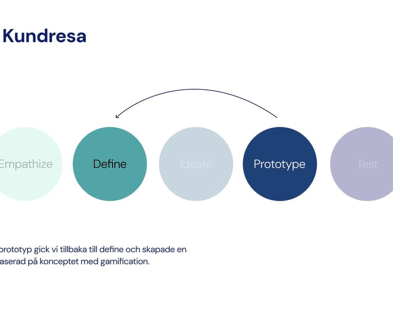
User-Centered Design Process
We based our work on the principles of User-Centered Design, ensuring that every step, from research to testing, focused on understanding and meeting the real needs of our users.
Define 📝
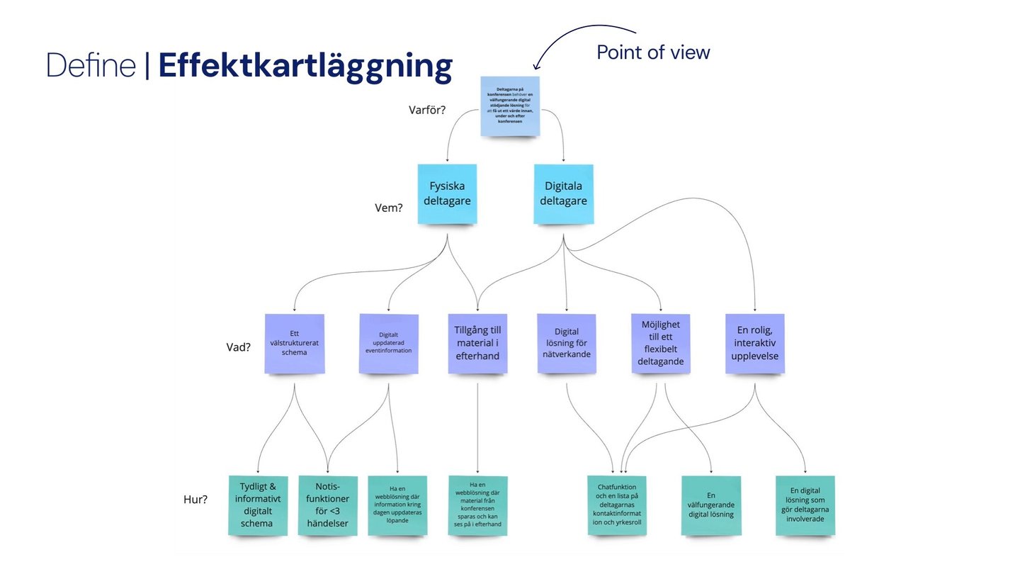
From our research, we defined the problem from the participant’s perspective:
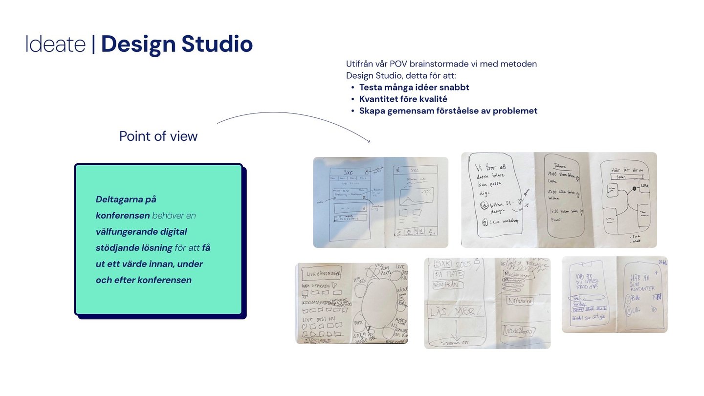
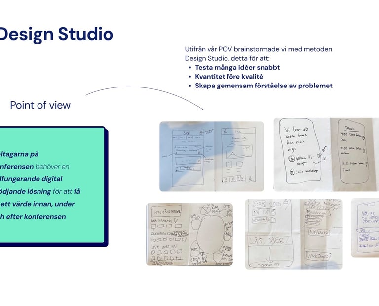
"Conference attendees need a well-functioning digital support solution to gain value before, during, and after the event."
This POV helped us focus on creating a solution that was relevant at every stage of the conference journey.
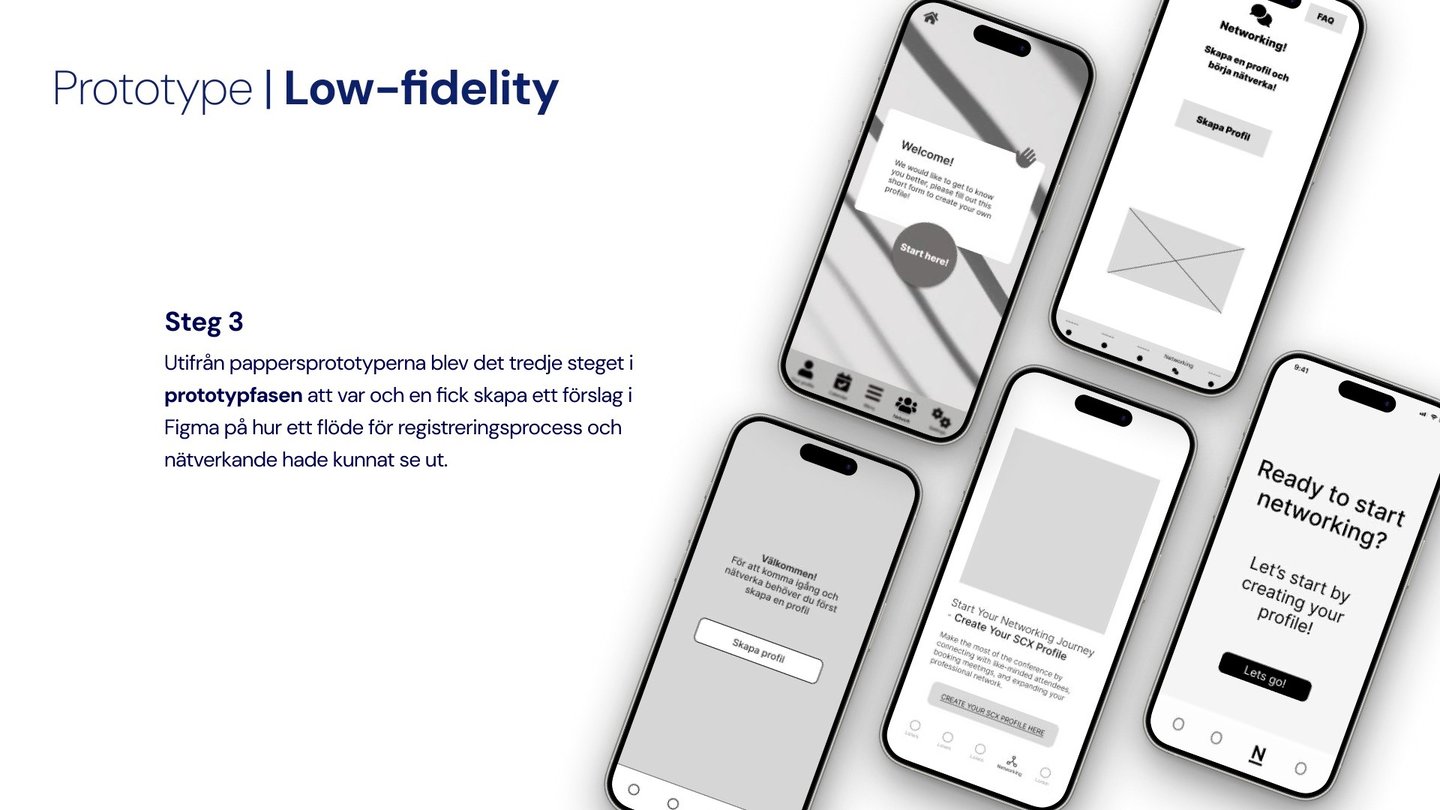
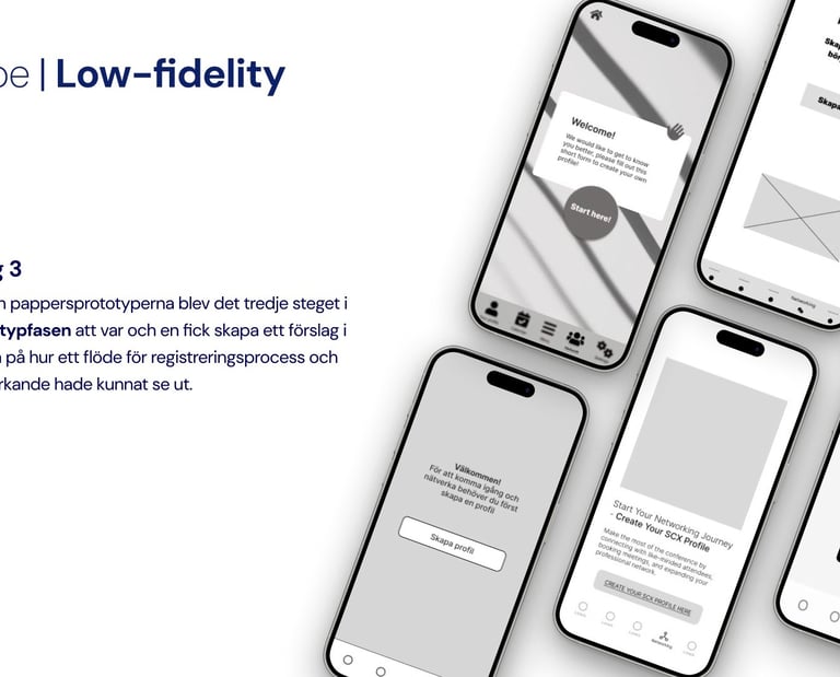
Prototype 🛠️
Next, we translated our sketches into low-fidelity wireframes in Figma, focusing on core flows like:
Registration process
Profile creation
Networking interactions
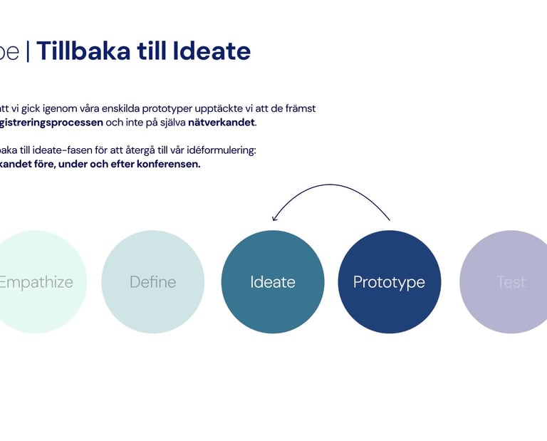
At this stage, we discovered our concepts leaned too heavily on registration rather than networking. This insight led us to revisit our How Might We questions to stay aligned with our problem statement.

Empathize 🧑🤝🧑
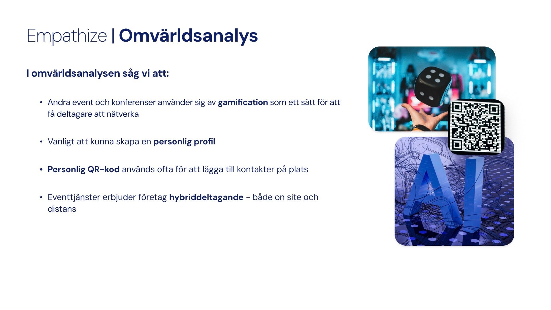
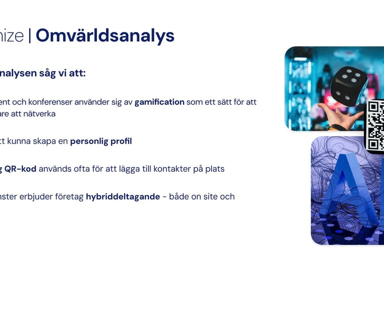
We benchmarked existing event platforms to identify common patterns and opportunities. We found that:
Gamification is often used to encourage participants to network.
Personal QR codes are a standard tool for exchanging contact details.
Hybrid participation (on-site + remote) is now an expected feature.
These findings helped us understand the baseline expectations and where SXC could differentiate.
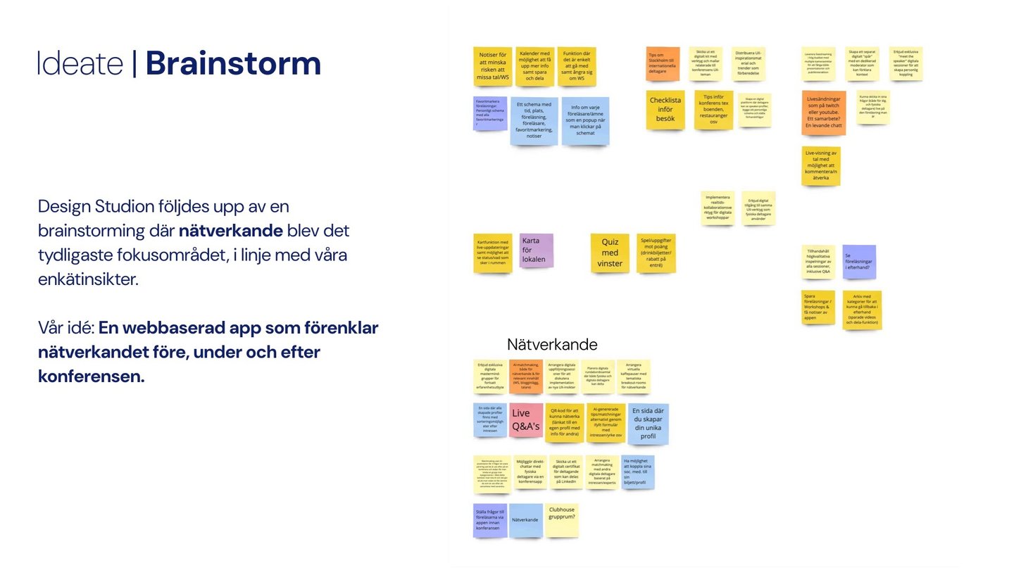
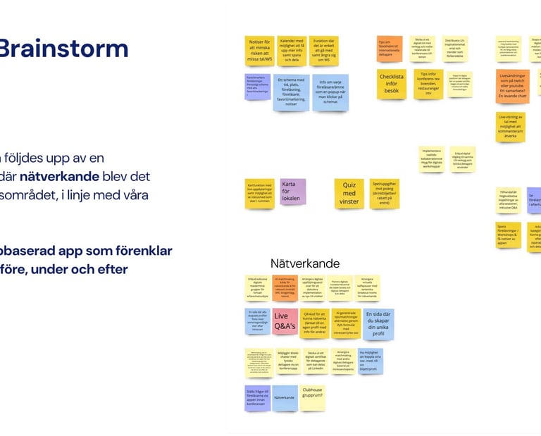
Ideate 💡
Building on the Design Studio sketches, we held structured brainstorming sessions. The goal was to generate as many solutions as possible, focusing on quantity first, then clustering and refining.
Key themes that emerged:
Simplifying networking before, during, and after the event.
Making it easy to exchange contact information quickly.
Supporting both remote and on-site participants equally.
Iterate and Ideate again
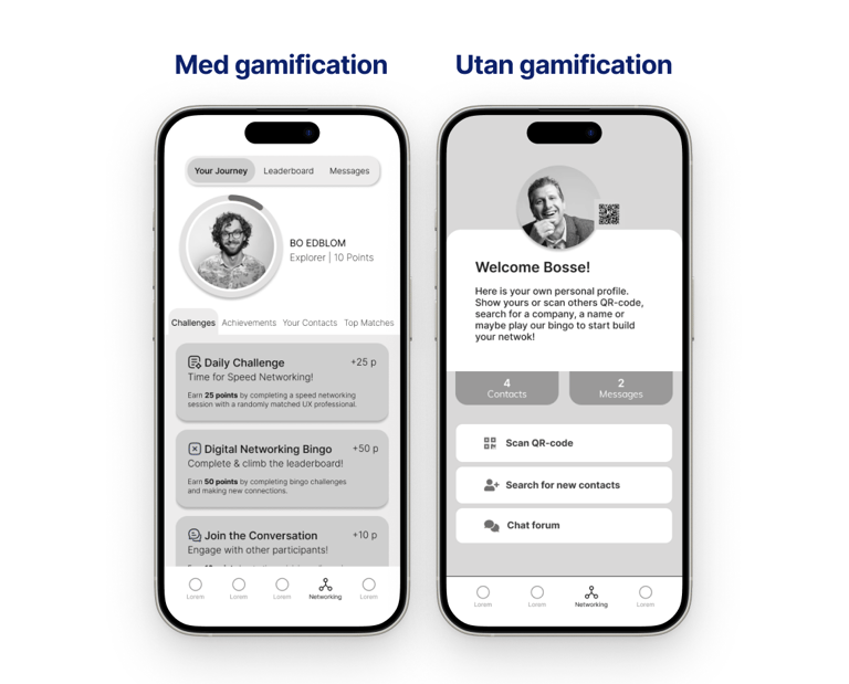
To compare our two design directions, we ran an A/B test:
Gamification concept – networking challenges, points, badges, and leaderboard.
Non-gamified concept – participant list, suggested matches, conversation starters.
This allowed us to gather feedback on user preference, motivation, and ease of use.
Low-fidility
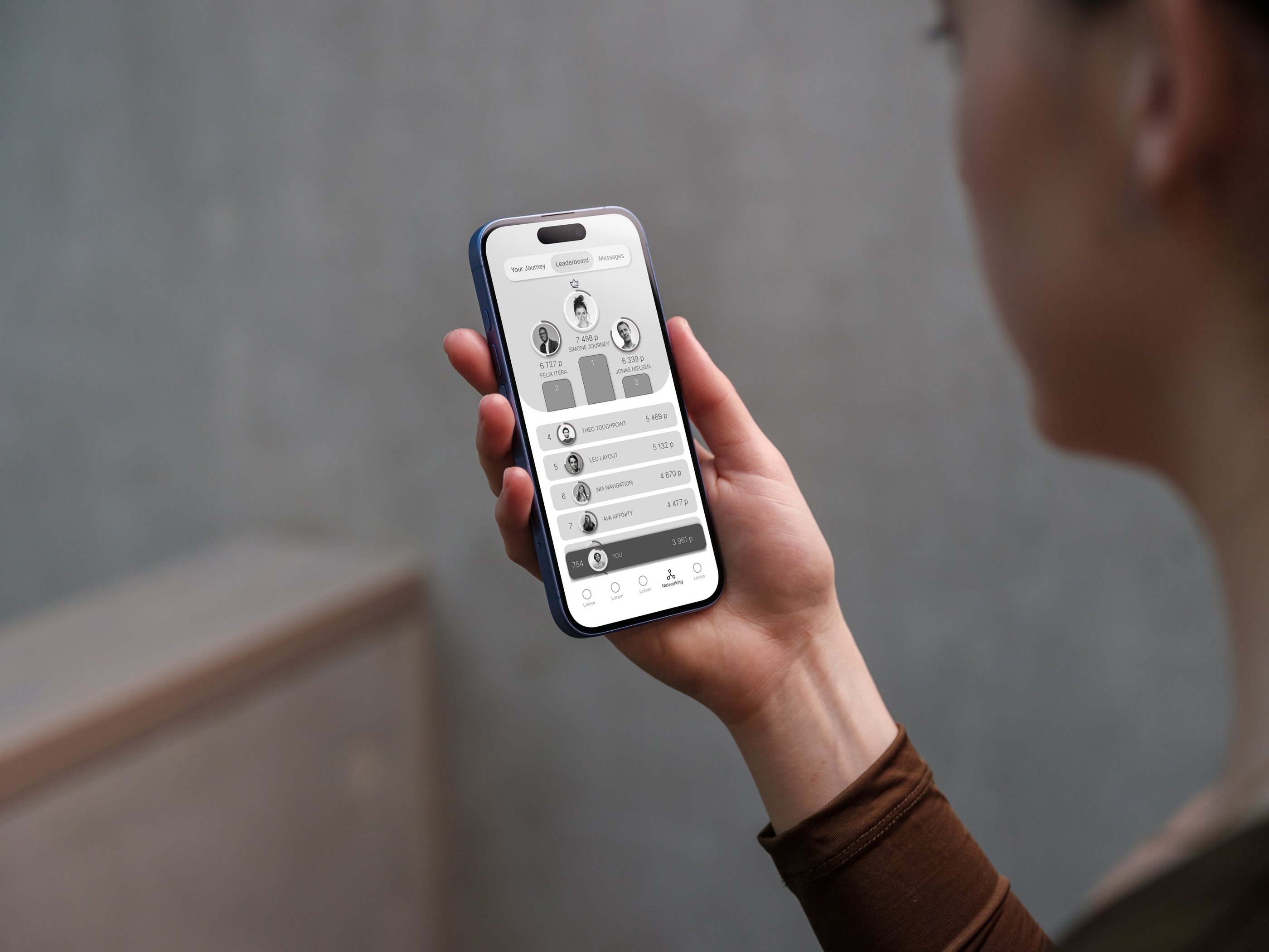
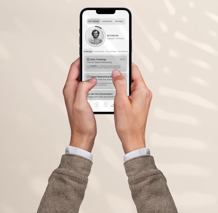
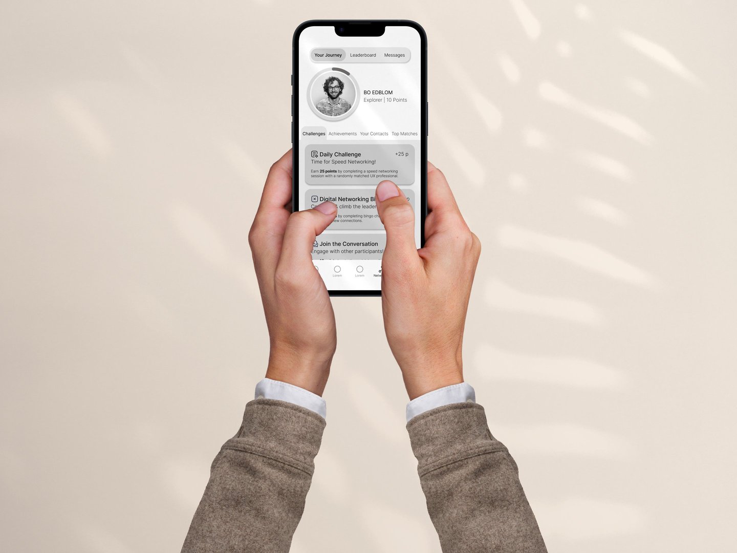
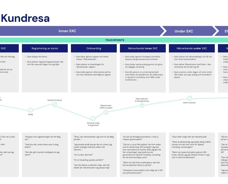
User Journey with gamification
We visualized the participant’s experience across the timeline of the conference:
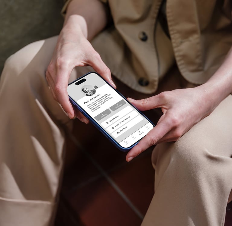
Before the conference
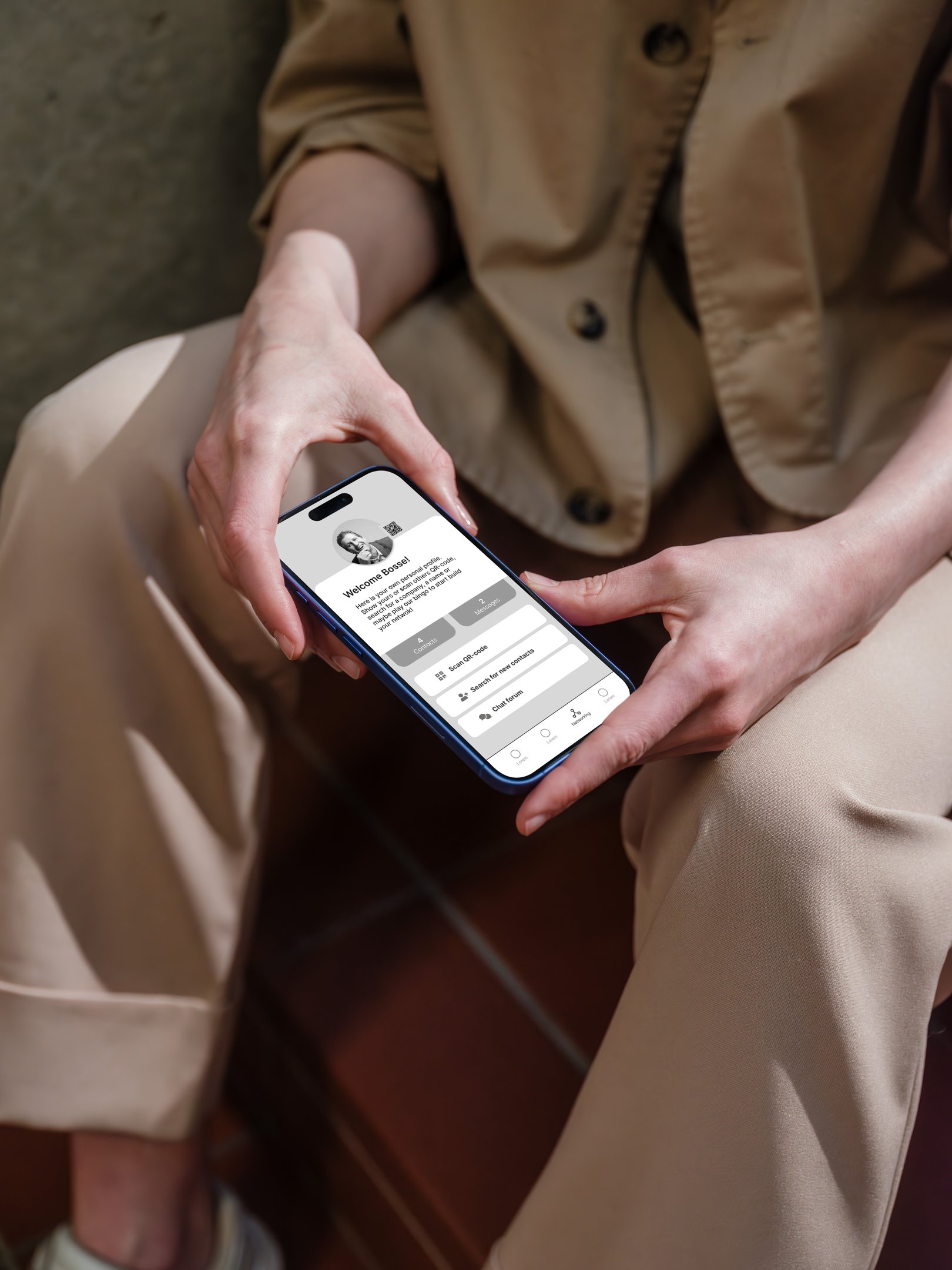
User creates a profile and receives a personal QR code.
Networking challenges are introduced (e.g., “connect with 3 new people in your field”).
Motivation: sets expectations and encourages early engagement.
During the conference
User earns points and badges by completing networking challenges (e.g., scanning a contact’s QR code, attending a session together).
Leaderboard creates visibility of progress and playful competition.
Motivation: lowers the barrier to starting conversations and makes networking feel structured and fun.
After the conference
User has a record of all contacts, notes, and earned badges.
Can continue conversations digitally via the app.
Motivation: creates long-term value and extends the event beyond its physical duration.
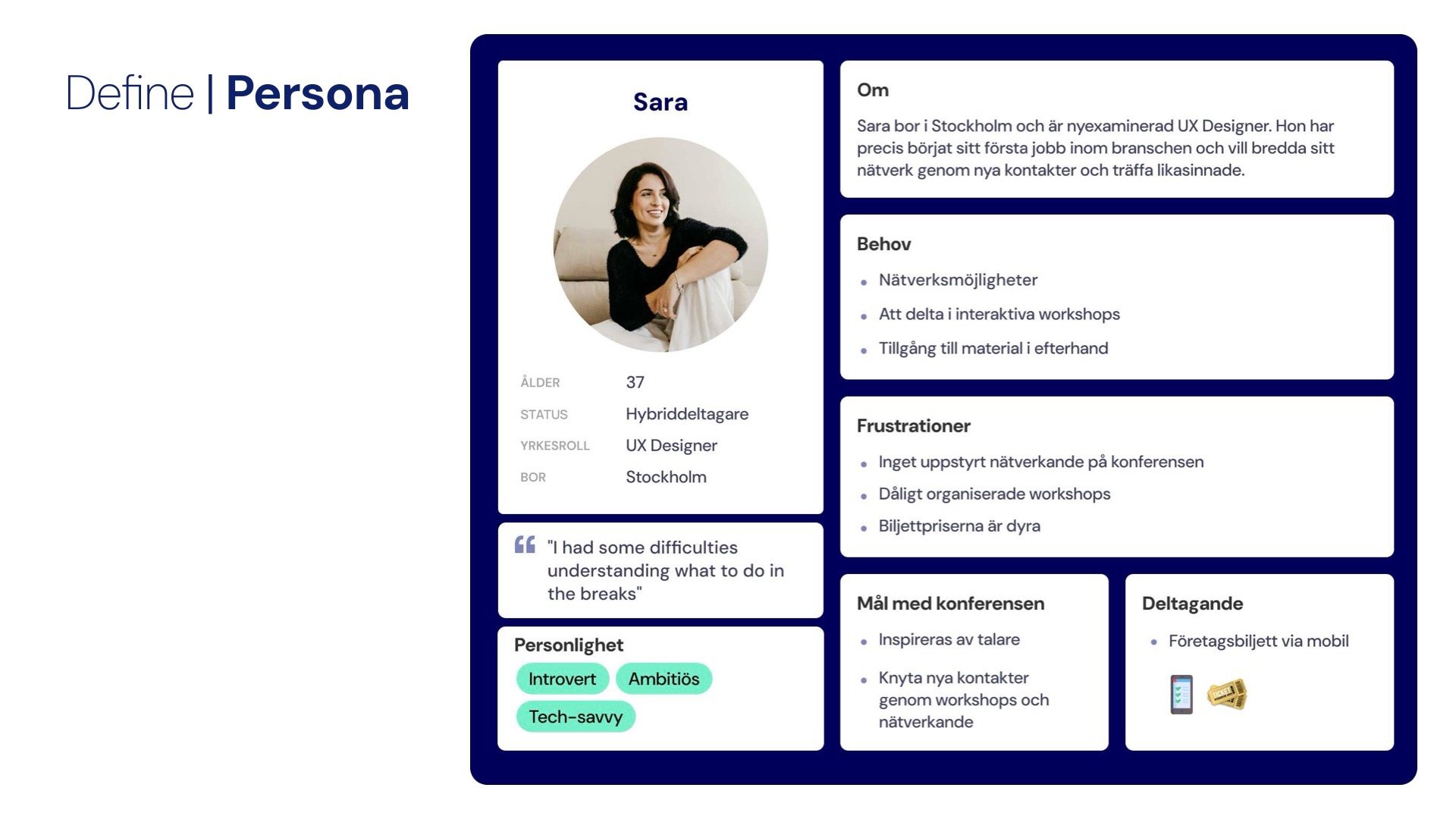
Based on our research, we created a persona representing a typical attendee:
“The Curious Networker” – mid-career professional who values learning but also sees networking as the main reason for attending.
Goals: meet new people in the industry, exchange knowledge, and maintain contacts after the event.
Frustrations: limited time to connect, difficulty remembering people met, and challenges bridging digital/physical interactions.
This persona guided our design decisions throughout the project.
Environmental Analysis
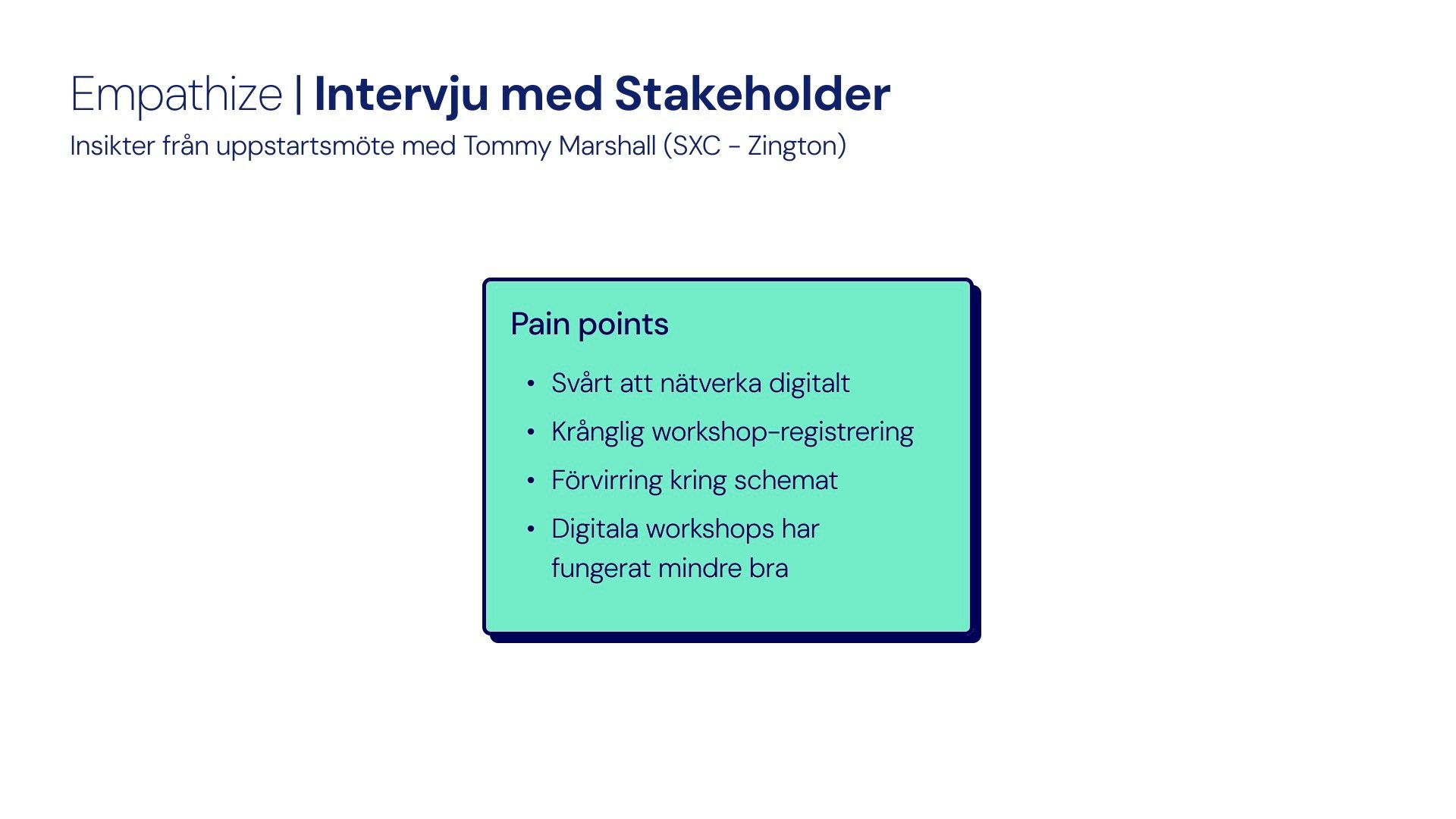
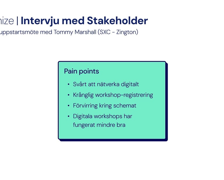
From an interview with the event organizer, we identified key pain points:
Networking is difficult, especially for digital participants.
Workshop registration is confusing.
The schedule can feel unclear.
Digital workshops have been less successful.
This gave us insight into both organizational challenges and participant frustrations.
Interviewing Stakeholders
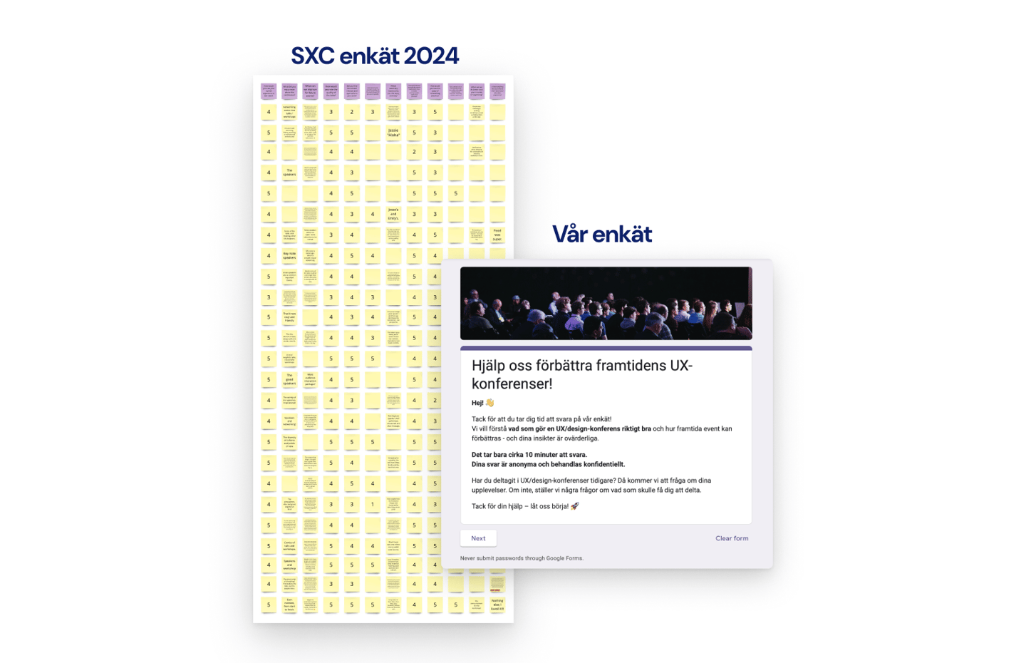
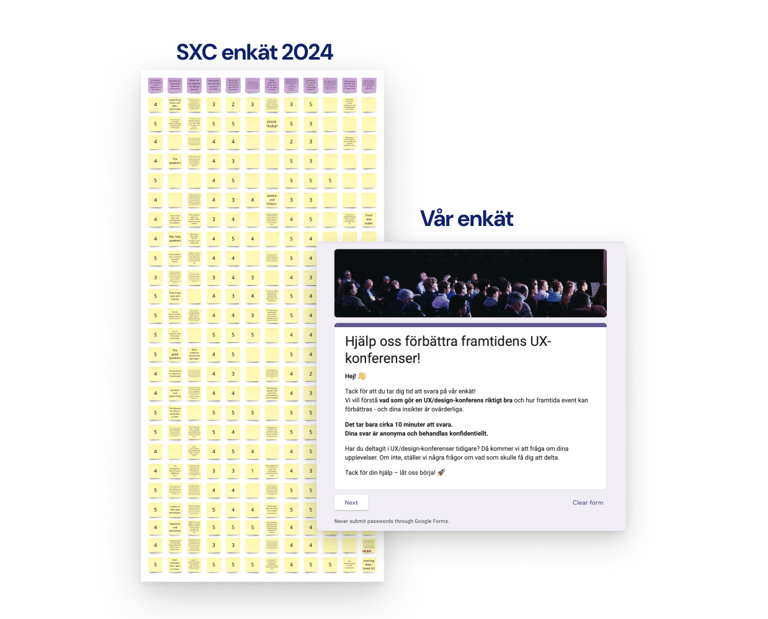
Surveys
We conducted a survey with SXC participants to better understand their needs. The results showed that:
Networking is rated as one of the most valuable aspects of the conference.
Participants highlighted the importance of having a unifying theme and structured ways to connect.
This confirmed our focus on networking as the primary design opportunity.
Persona
Point of View (POV)
Design Studio
With our HMWs and effect map as input, we ran a Design Studio workshop. Each team member sketched possible solutions individually, then we shared, critiqued, and iterated together.
The method encouraged quantity over quality early on, ensuring we explored a wide range of ideas.
It also created a shared understanding of the problem space within the team.
From this exercise, networking emerged as the most promising focus area, aligning with both survey data and stakeholder pain points.
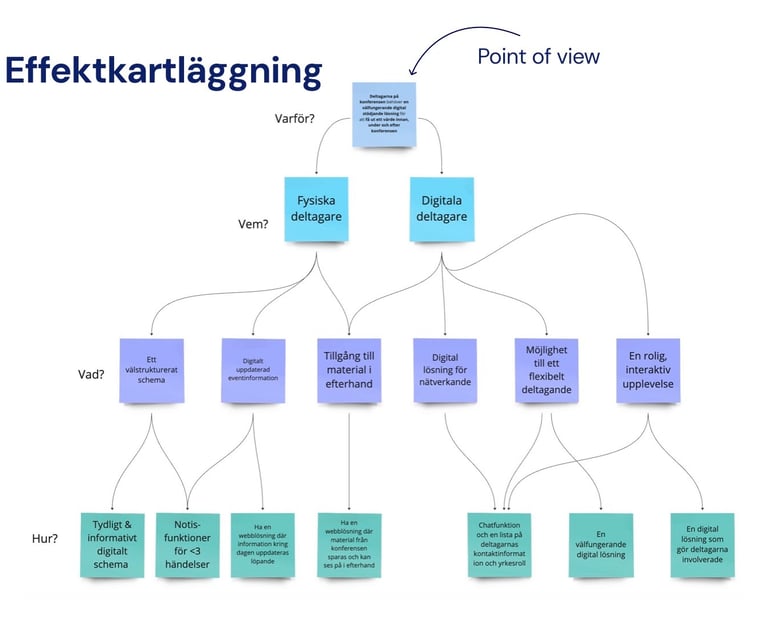
Effect Mapping
To connect user needs with business goals, we created an effect map. It illustrated:
Goals – stronger community, higher satisfaction, long-term engagement.
Actors – participants (on-site & remote), organizers, speakers.
Needs & actions – easy networking, clear schedule, access to material afterwards.
Features – personalized profiles, QR code contact exchange, networking challenges, hybrid participation support.
This mapping helped prioritize features that delivered both user value and organizational outcomes.
Brainstorming
Concept Directions
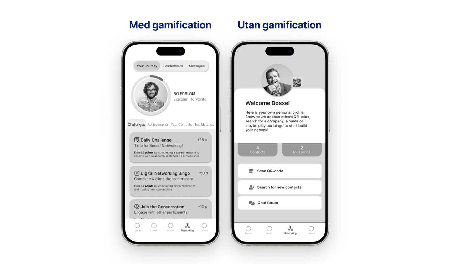
With Gamification
Participants earn points and badges for completing networking challenges.
A leaderboard motivates engagement and adds a playful element.
Designed to lower barriers and make networking more approachable.
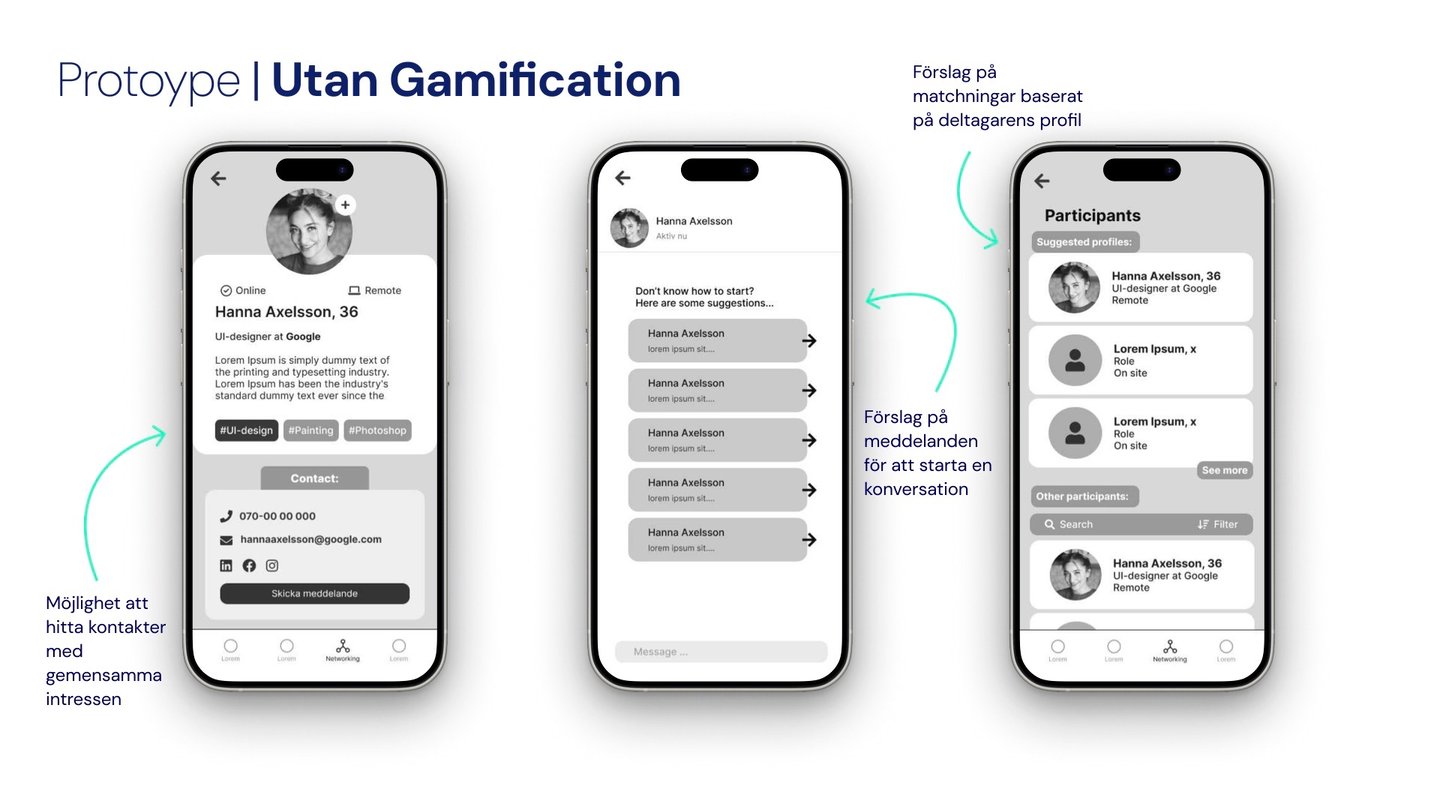
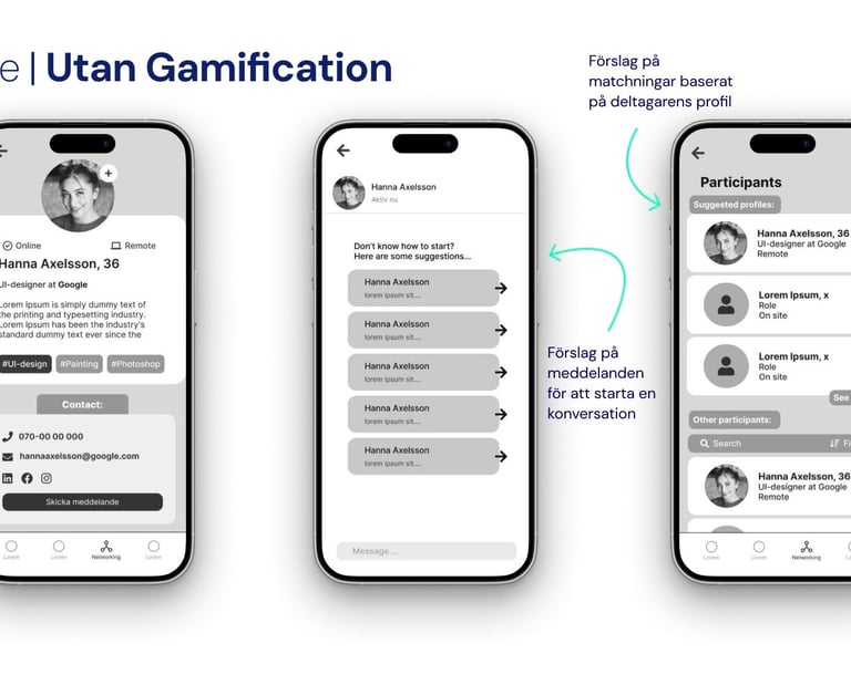
Without Gamification
Focus on smart profile matching and suggested connections.
Provides conversation starters and recommended contacts based on shared interests.
Designed to keep networking simple and inclusive without competitive elements.
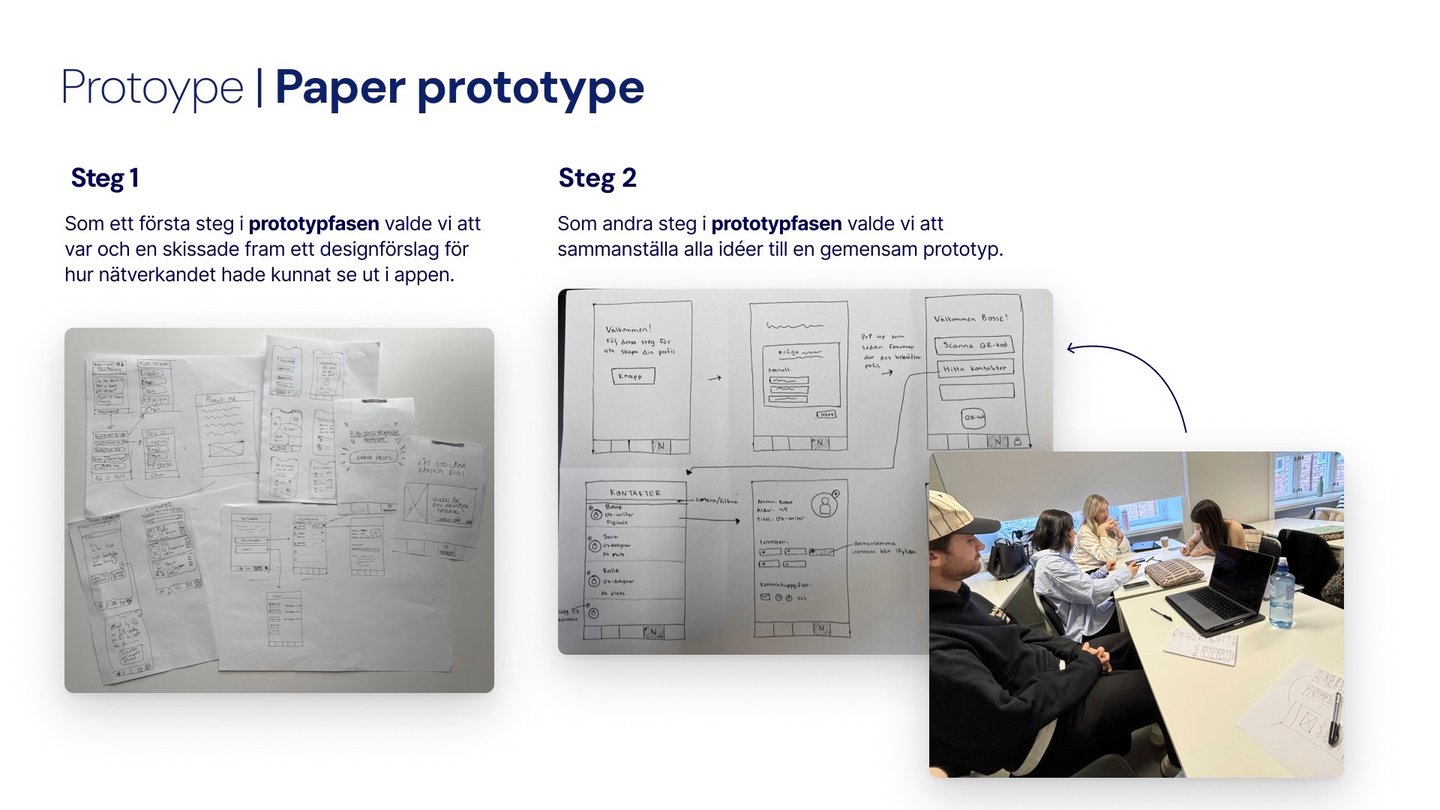
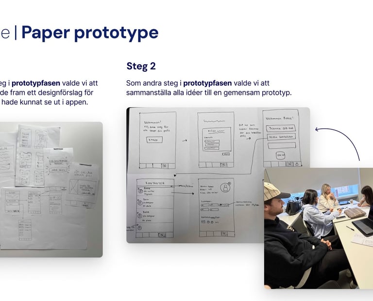
Paper Prototypes
We began with paper sketches, where each team member visualized how networking could work in the app. This allowed us to quickly test and communicate different approaches without investing time in high-fidelity design.
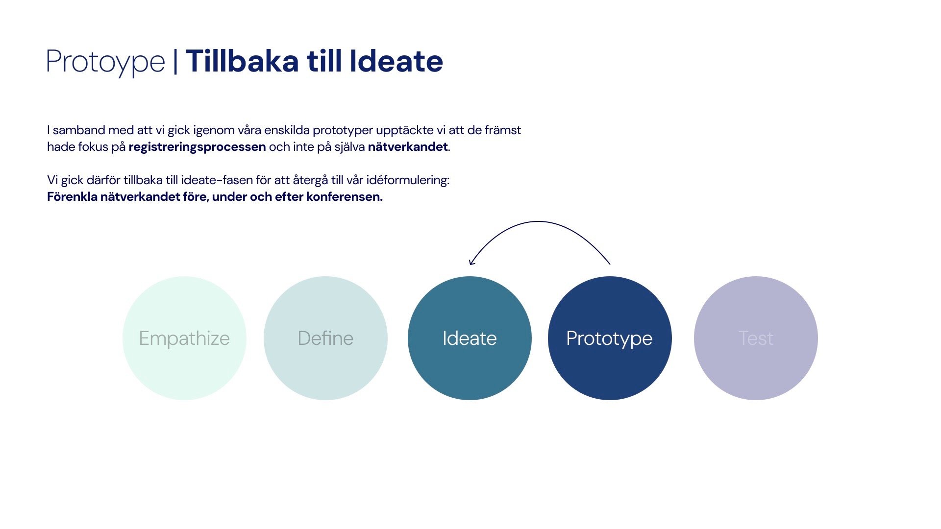
During our first round of prototyping, we realized that many of our wireframes focused mainly on registration flowsrather than solving the core challenge: networking. To stay true to our problem framing, we paused and returned to the Ideate stage.
We asked ourselves: Are we really designing for the participant’s main need?
Our survey and interviews had clearly shown that networking was the most valuable part of the experience.
This led us to refine our concepts to emphasize meaningful connections above all else.
Revisiting the problem
Second Ideation
In this round, we sketched and brainstormed specifically around networking interactions. Two strong directions emerged:
Networking with Gamification
Participants complete fun challenges to earn points and badges.
A leaderboard creates playful competition and encourages exploration.
Designed to motivate hesitant networkers to take the first step.Networking without Gamification
Focuses on smart matching and recommended contacts.
Provides conversation starters and filters to find people with similar interests.
Designed to be simple, inclusive, and less competitive.
Iterate and Define again
After developing our first prototypes, we realized that we needed a clearer picture of when and how networking challenges would create value for participants. To do this, we returned to the Define phase and mapped out a user journey focused on the gamification concept.
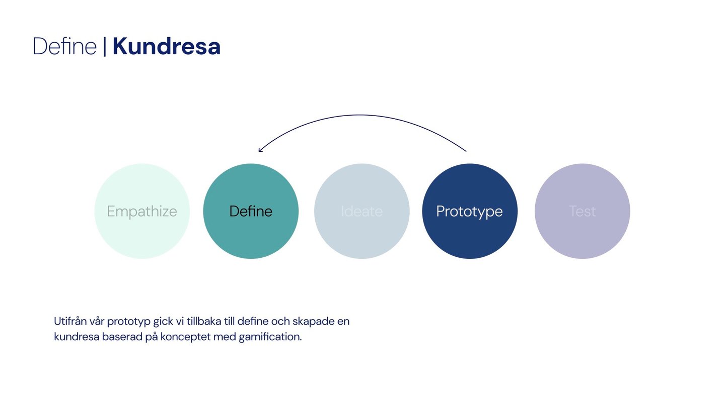
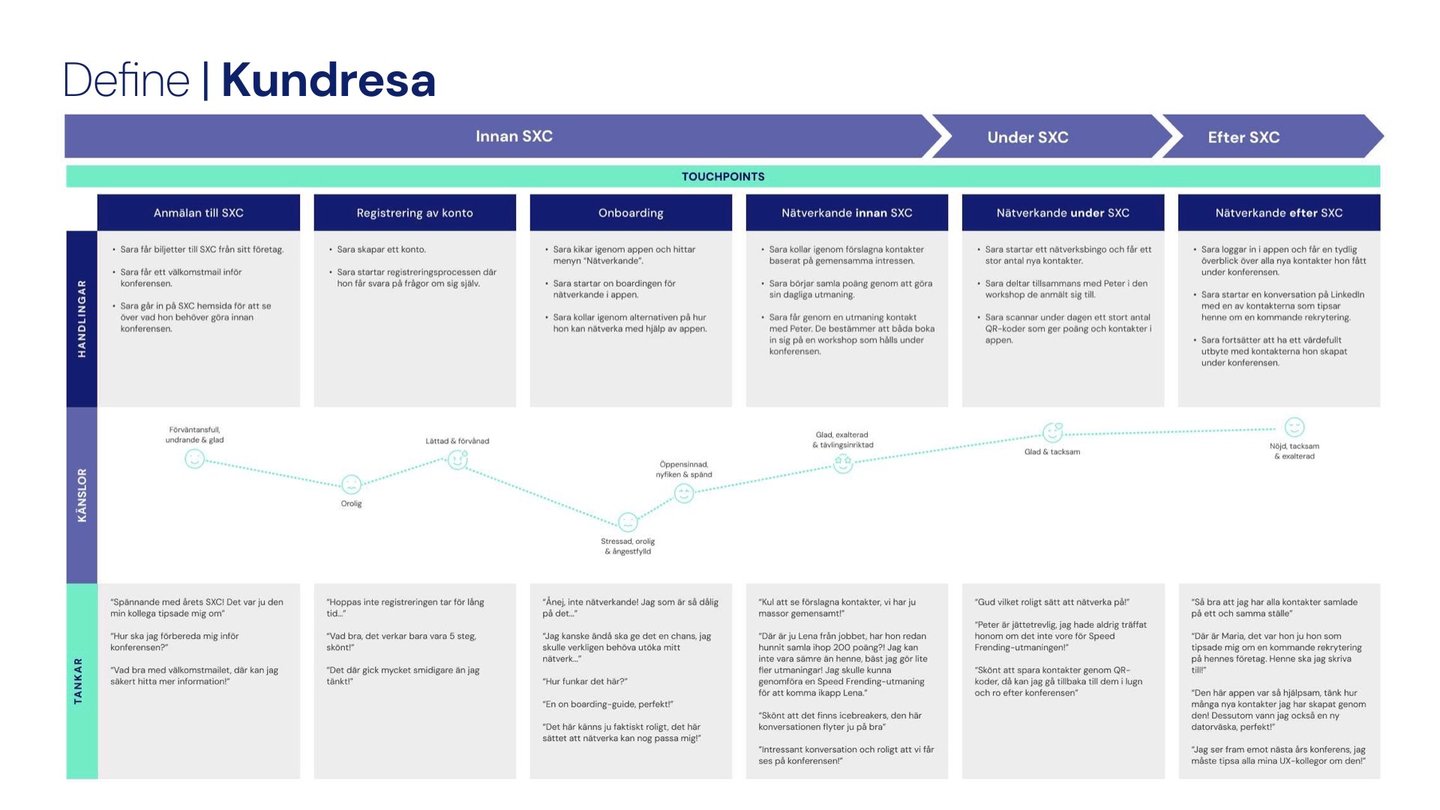
By mapping the journey, we clarified:
Touchpoints where gamification adds value without being intrusive.
Pain points where networking often fails (e.g., remembering contacts afterward).
Opportunities to extend engagement beyond the event.
This iterative Define step helped us refine our design so it aligned better with both user needs and the conference’s business goals.
Why This Step Was Important
Test 🔍
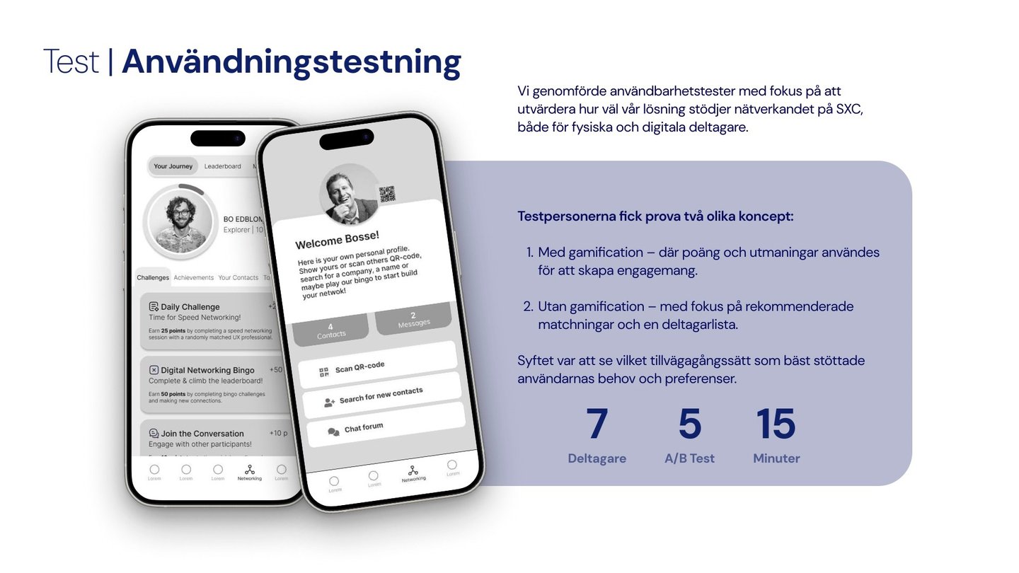
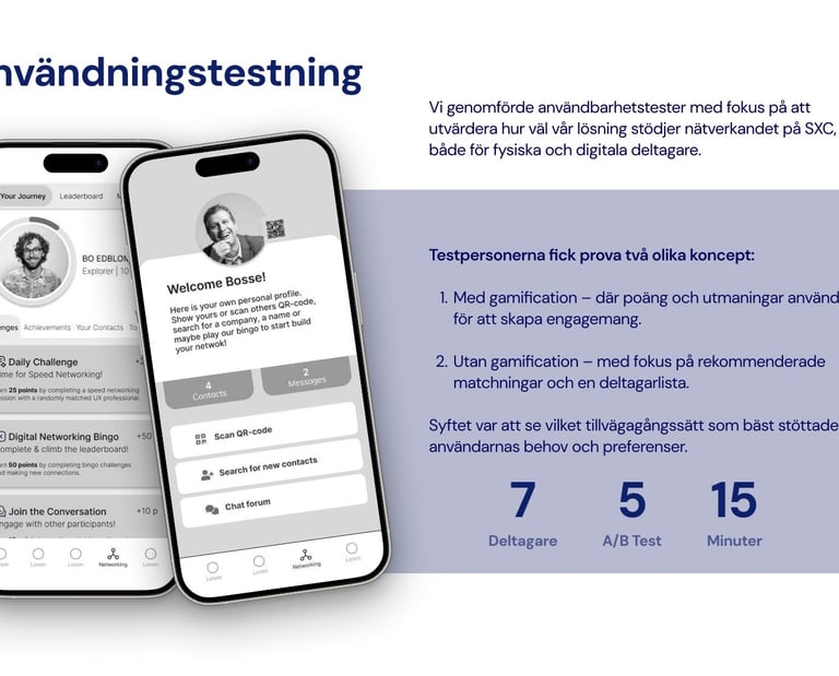
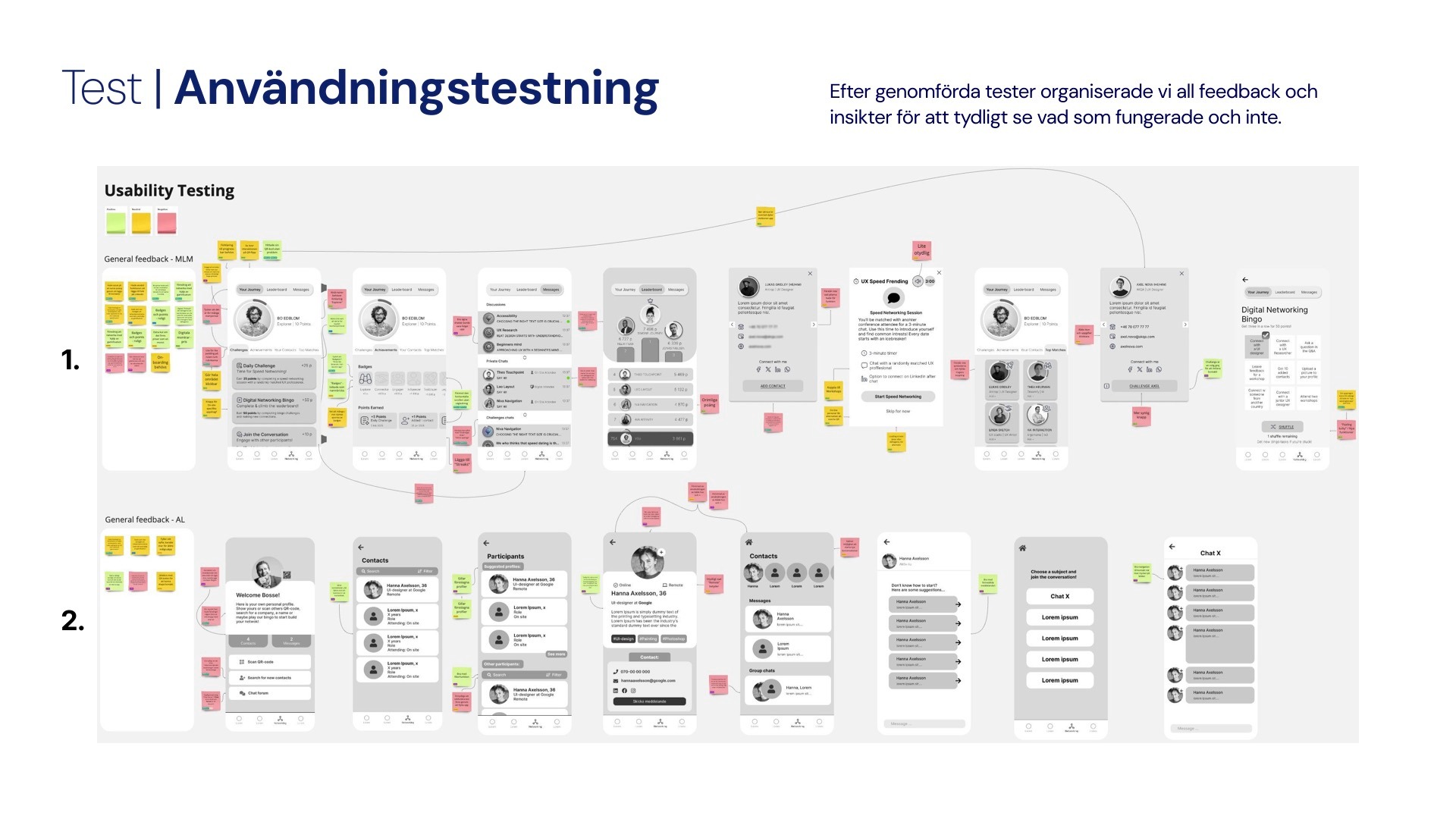
Usability Testing
We conducted usability tests to evaluate how well our prototypes supported networking, both for on-site and remote participants. Each participant was asked to complete core tasks such as:
Creating a profile
Exchanging contact details via QR code
Engaging with networking features (gamified or non-gamified)
Setup:
7 participants
15 minutes per session
Conducted as moderated tests
A/B Testing
Findings
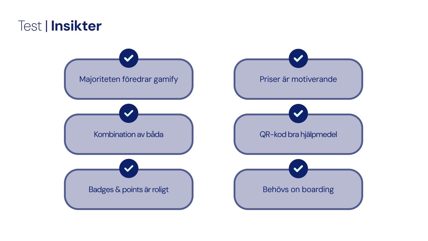
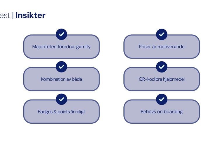
Key insights from the tests included:
Gamification was preferred by most participants, as it made networking feel more engaging.
Badges and points were motivating, especially when combined with visible progress.
Prizes and rewards were seen as fun incentives.
QR codes were well-received as a fast and simple way to exchange details.
A clear onboarding flow was needed to help users understand how the app worked.
Some participants suggested that a hybrid solution (mixing gamification with direct matching) could serve different preferences.

Recommendations
Keep Testing
Continue conducting research and user testing throughout the development process. Regular feedback is key to identifying usability issues and ensuring the solution meets real user needs.
Flexible concepts
Combine versions with and without gamification to accommodate different user preferences. This approach helps create a more inclusive and adaptable app.
Market Awareness
Regularly review existing digital services to learn from best practices and identify gaps. This approach helps avoid repeating mistakes and encourages innovation that truly meets user needs. Sometimes, using an existing third-party app might even be the best and most cost-effective solution.
Project Takeaways
Gamification
Gamification is an effective tool to promote networking, motivating many participants through competitions and rewards.
Teamwork and iteration
I learned that fast iteration and teamwork can lead to better solutions. Splitting in to smaller groups helped us explore and develop ideas efficiently.
I learned that user-centered design means looking at the whole journey, not just single interactions. Mapping touchpoints helped me create features that kept participants engaged throughout the event.
Designing for Engagement
Despite limited user data and tight deadlines, we managed to stay on track by building on earlier research, narrowing our scope, and iterating with simple prototypes. This way, we kept the solution user-centered, easy to test, and realistic within the project’s constraints.