
Express Food Delivery App
Kvick is a fictional grocery delivery app created for an educational UI design assignment. The high-fidelity interface emphasizes fast, intuitive ordering with large visuals and a clear, accessible design for a smooth user experience.
Kvick
Eco-friendly grocery delivery app for busy Stockholmers, built for speed.

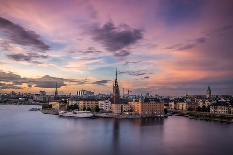
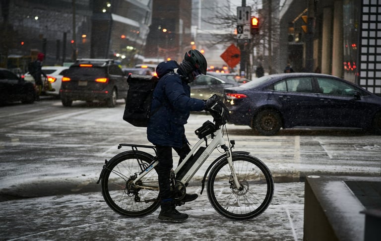
Kvick delivers groceries and recipe kits within 10 minutes, made for busy people in Stockholm. With bike deliveries from its own dark stores, it’s a quick and eco-friendly way to get what you need. The simple app makes ordering easy, so you can focus on what matters.
Challenge
The task was to take over from the user researcher and transform selected wireframes into a high-fidelity concept that feels realistic and detailed. The aim was to design a visually appealing and communicatively effective interface for an MVP, ready to be presented to an entrepreneur and later developed for real user testing. The focus was on applying strong UI principles to enhance both usability and the overall user experience.
How might we create a super-fast, easy grocery app that fits busy Stockholm lives and stays green?
Objective
Design a fast and intuitive grocery app for mobile and tablet, making it easy for busy Stockholmers to shop in minutes.
Build an accessible and consistent design system with a clear color palette and readable typeface to support a smooth user experience.
What is it? What is it not?
A quick, simple app for delivering groceries. It's unique because it gets all its products from its own central "dark stores," not from existing supermarkets or restaurants. Deliveries are made exclusively by bike, keeping the service fast and eco-friendly.
It is not a platform for ordering restaurant food, nor does it partner with third-party grocery stores. It's not designed for people who need to do a large, heavy shopping trip, and it doesn't include features for long-term meal planning.
For whom? For whom is it not?
Kvick is for the spontaneous shopper who needs groceries fast. It's for people who can't leave their home, perhaps because they're looking after a child or pet, and for those who need to get a few things delivered urgently. While it can also work for someone who needs help carrying a large order, the limited weight for bike delivery means it's best for smaller, unplanned buys.
This service is not for anyone who wants restaurant delivery. It's also not for customers who prefer to plan their shopping well in advance and don't make impulsive purchases.
What's the goal? What is not included?
The goal is to create an appealing and user-friendly app for spontaneous customers. The service's unique selling point is its independent supply chain with its own storage, which allows for potentially better prices.
The service intentionally excludes several things: restaurant orders, purchases from external stores, large-scale or weekly shopping, and scheduled deliveries. A minimum order of 150 kr is also required to make the business profitable.
Define the task
The Project
Background of the project
This project was part of an individual assignment for a UI design course. The challenge was to design a high-quality interface for a fictional app that delivers groceries and recipe kits super fast, within 10 minutes, in central Stockholm. The concept is based on a made-up entrepreneur and user researcher who wanted to compete with services like Foodora Market but focus only on groceries without including restaurant food. The groceries come exclusively from the app’s own dark storage facilities, with all deliveries made by bike to keep the service eco-friendly. There is no delivery from existing stores or supermarkets. The main goal was to practice making smart design choices, improve how the app looks and feels, and build something solid for a portfolio, from scratch.
My Role
As this is an individual school assignment, I took on the role of the sole UX/UI designer responsible for all stages of the project, including research, concept development, wireframing, prototyping, and visual design.
Timeline
The project was completed over the course of one month as part of a school assignment. The timeline included phases for initial research, ideation, wireframing, prototyping, user feedback, and final design delivery.
Tools
The primary design tool used for this project was Figma, which allowed me to create wireframes, interactive prototypes, and high-fidelity UI designs. Additional tools included Google Docs for documentation and online resources for design inspiration.
The goal with the project
The goal of this project was to practice and demonstrate my ability to design a user-friendly, visually appealing, and functional mobile and tablet app interface for express grocery delivery. This exercise also aimed to develop skills in rapid prototyping and user-centered design, preparing me for real-world UX/UI challenges.
Design process
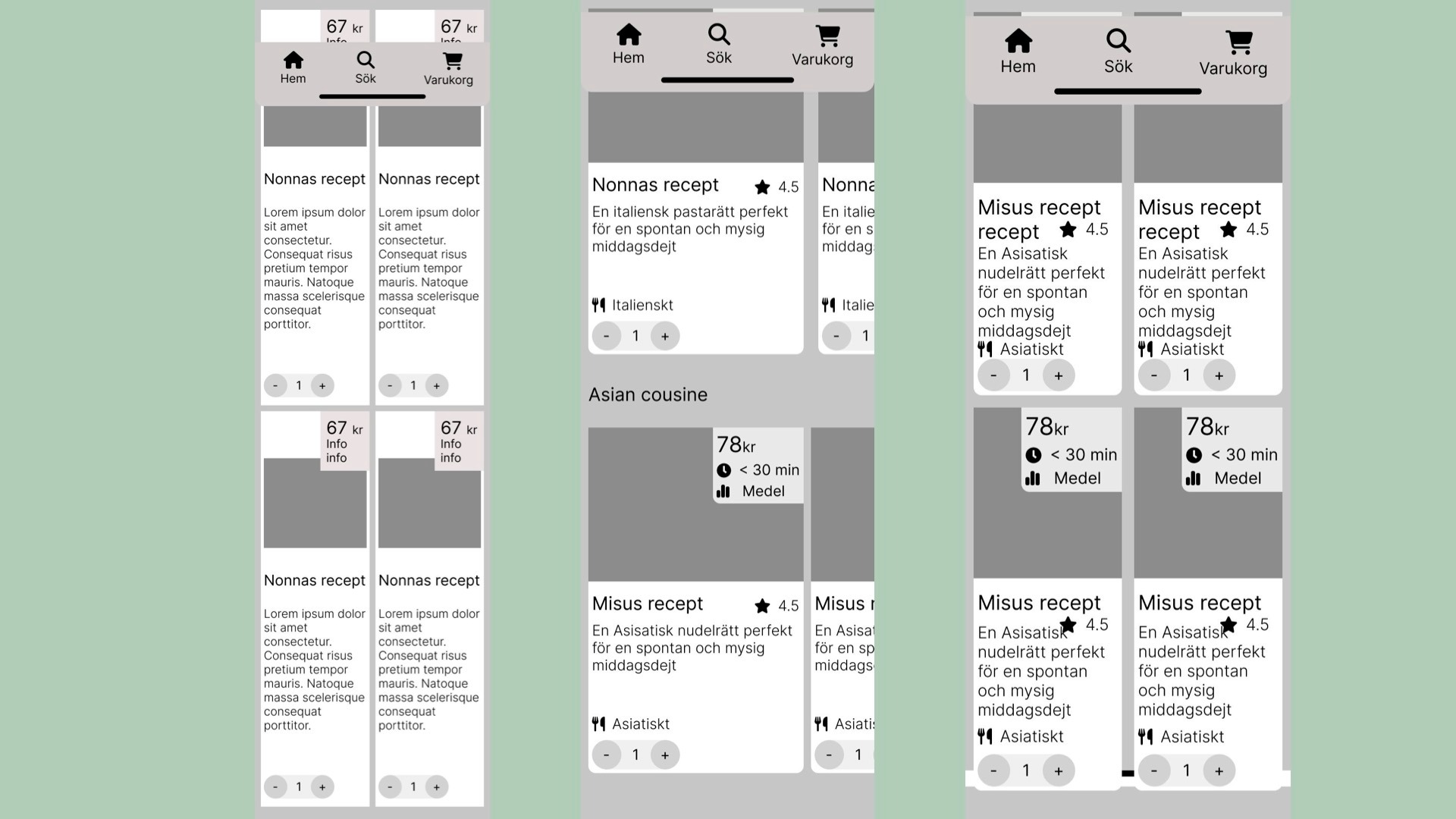
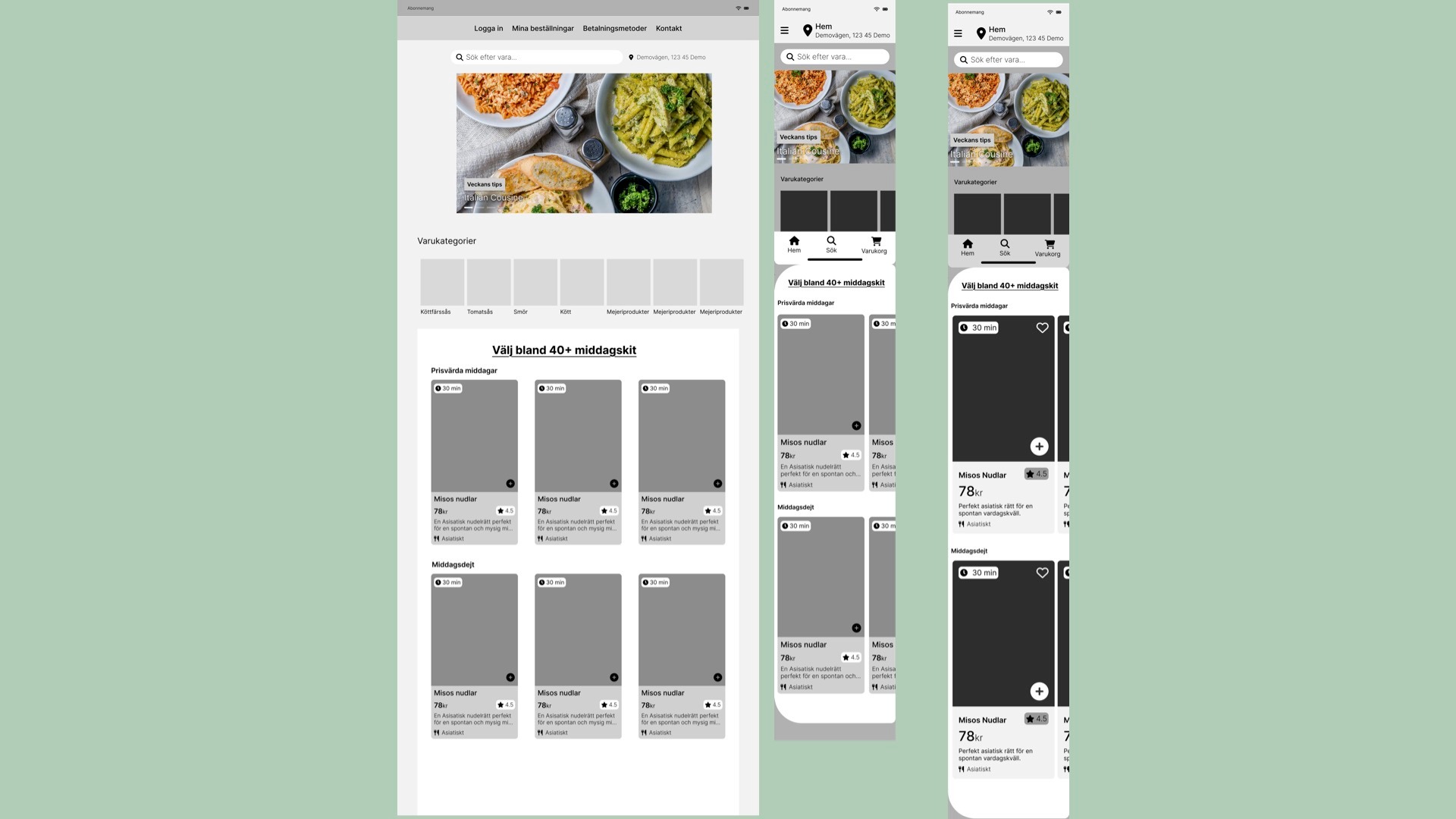
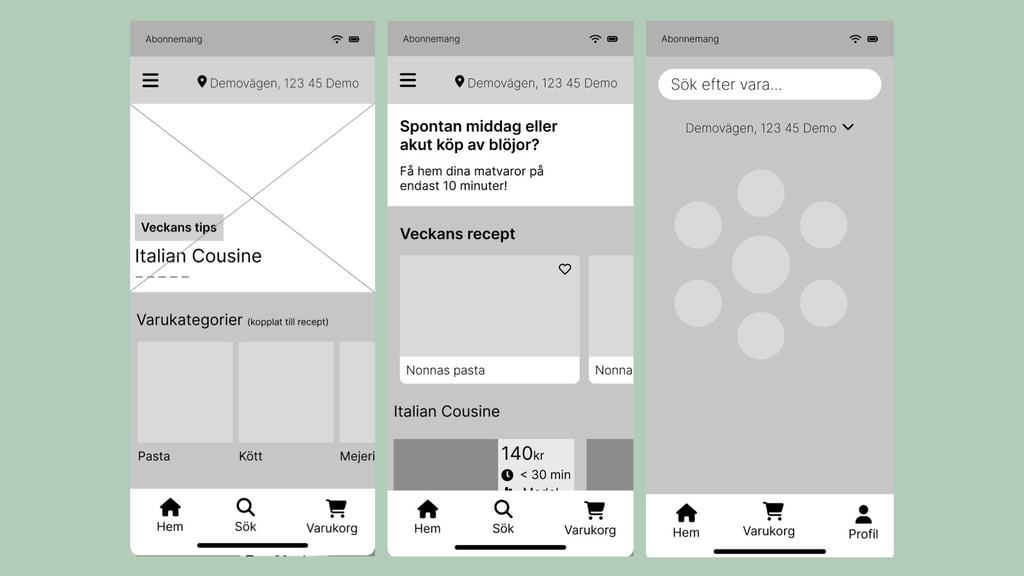
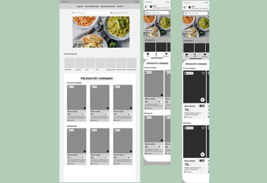
Mockup 1
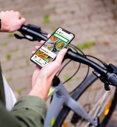
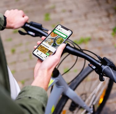
In my design process, I started by analyzing successful grocery and food delivery apps to understand key usability patterns. I then incorporated insights from the research team’s wireframes and findings from user testing. The design was developed with a mobile first mindset to prioritize a seamless and intuitive experience on mobile devices.
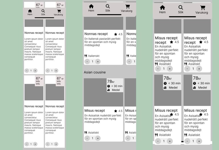
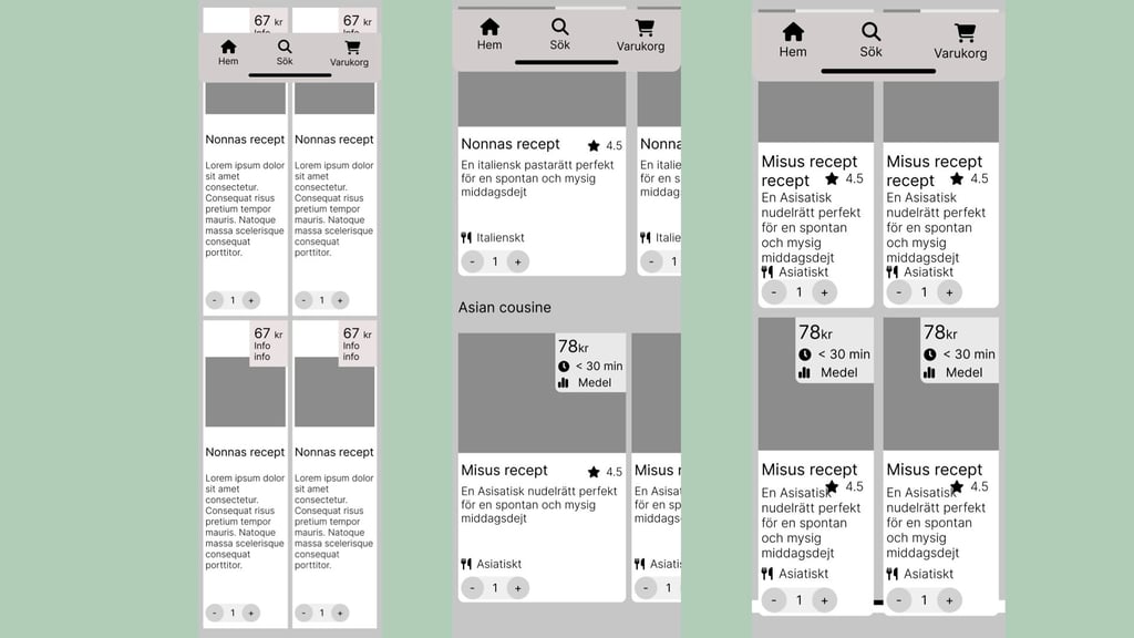
Mockup 2
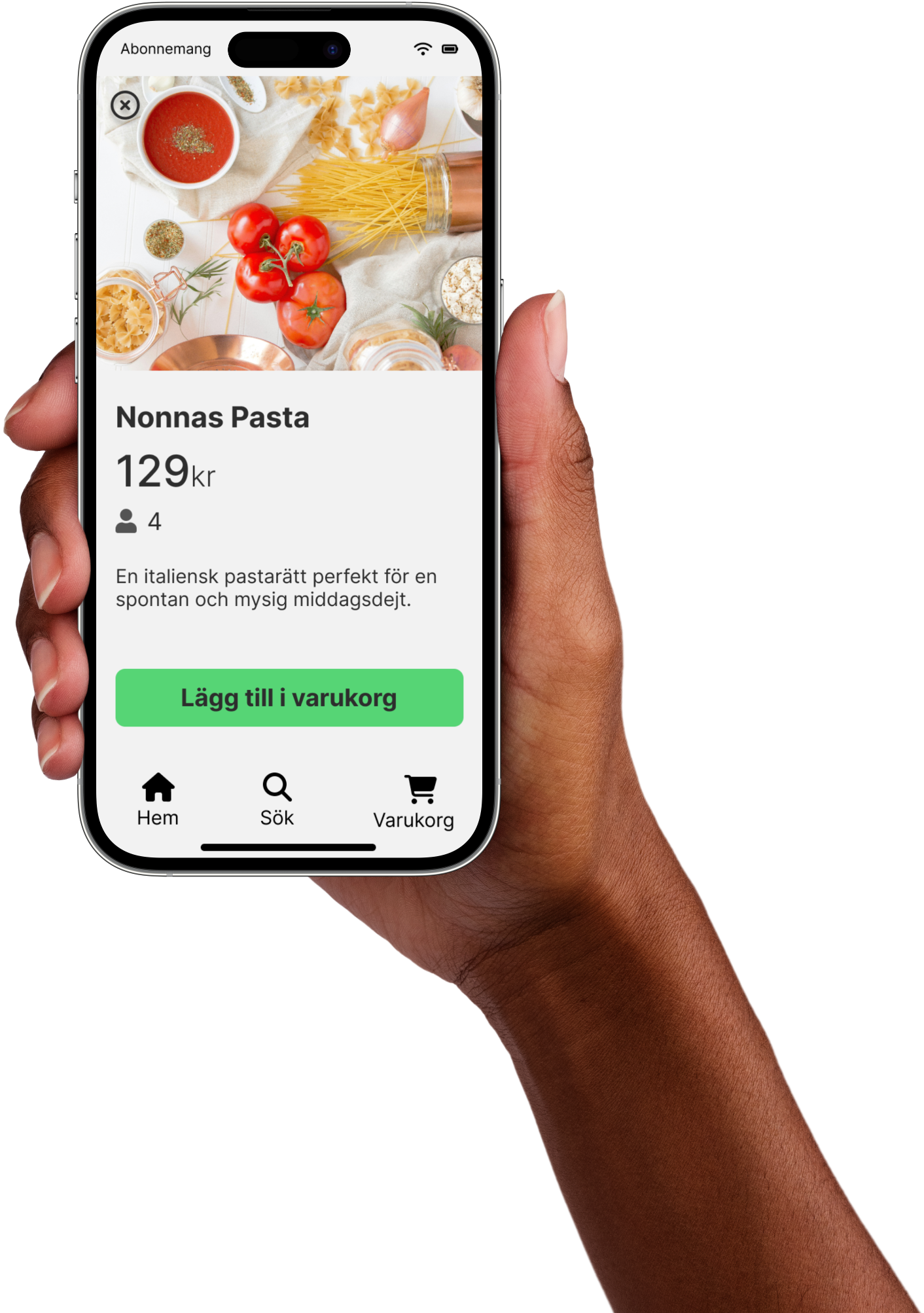
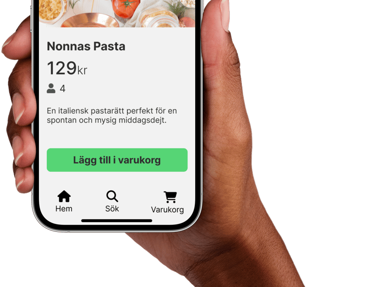
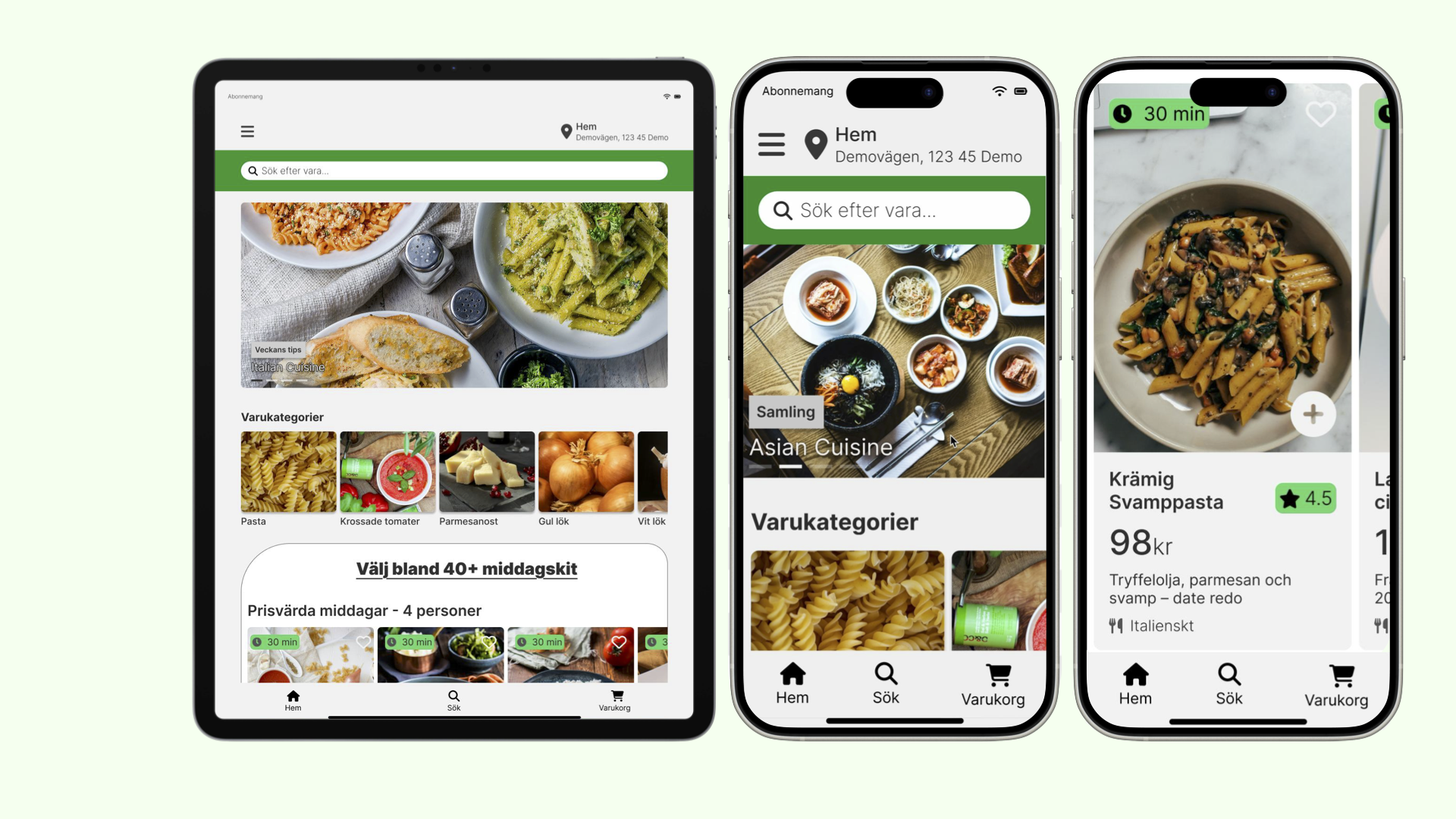
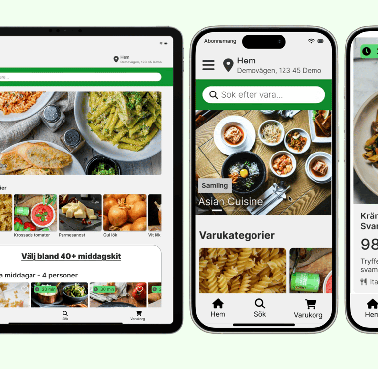
During this phase, I explored and compared several variations of the hero section to determine which design best captured the app’s core value proposition. I focused on clarity, visual impact, and relevance to the target users to ensure the chosen hero section would immediately communicate the app’s benefits and encourage engagement.
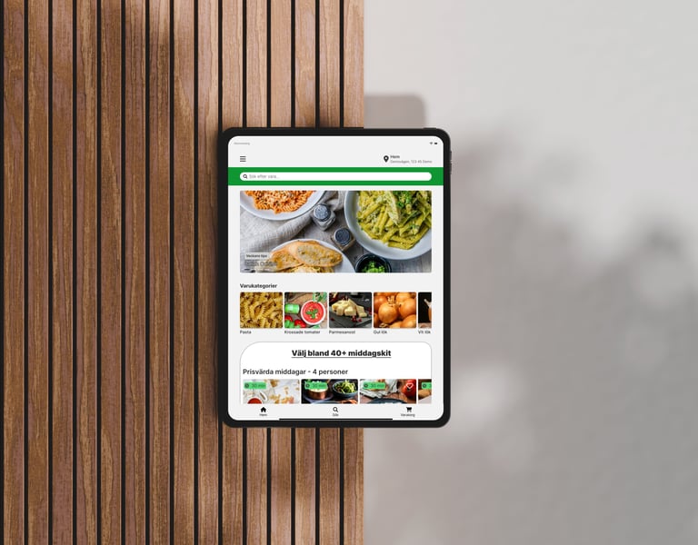
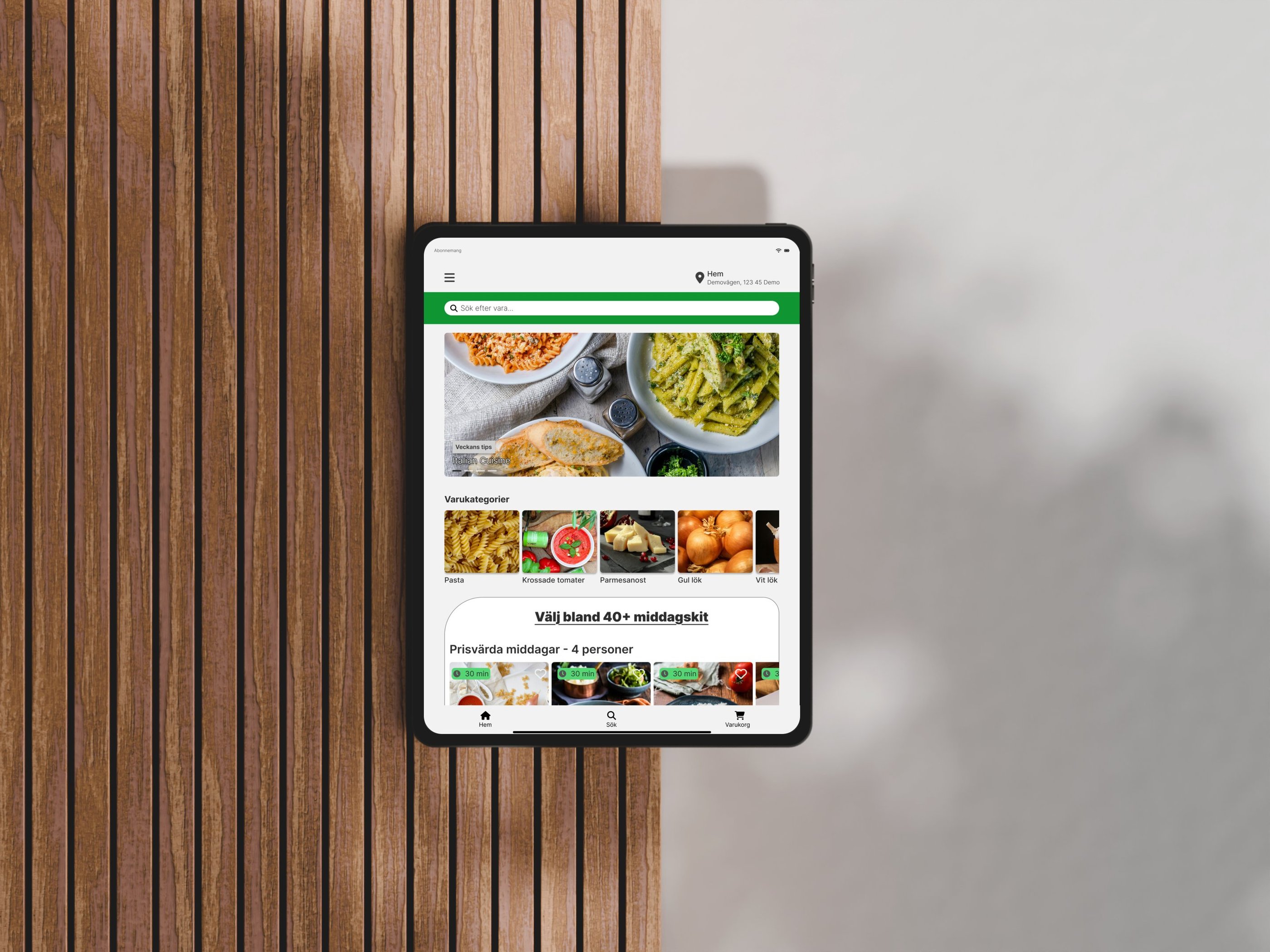
In this stage, I carefully refined key UI elements like button sizes, spacing, and visual hierarchies to create a balanced and intuitive interface within a clean monochromatic design system. I ensured interactive elements were easily tappable and that the layout guided users naturally. I also finalized the tablet design for responsiveness.
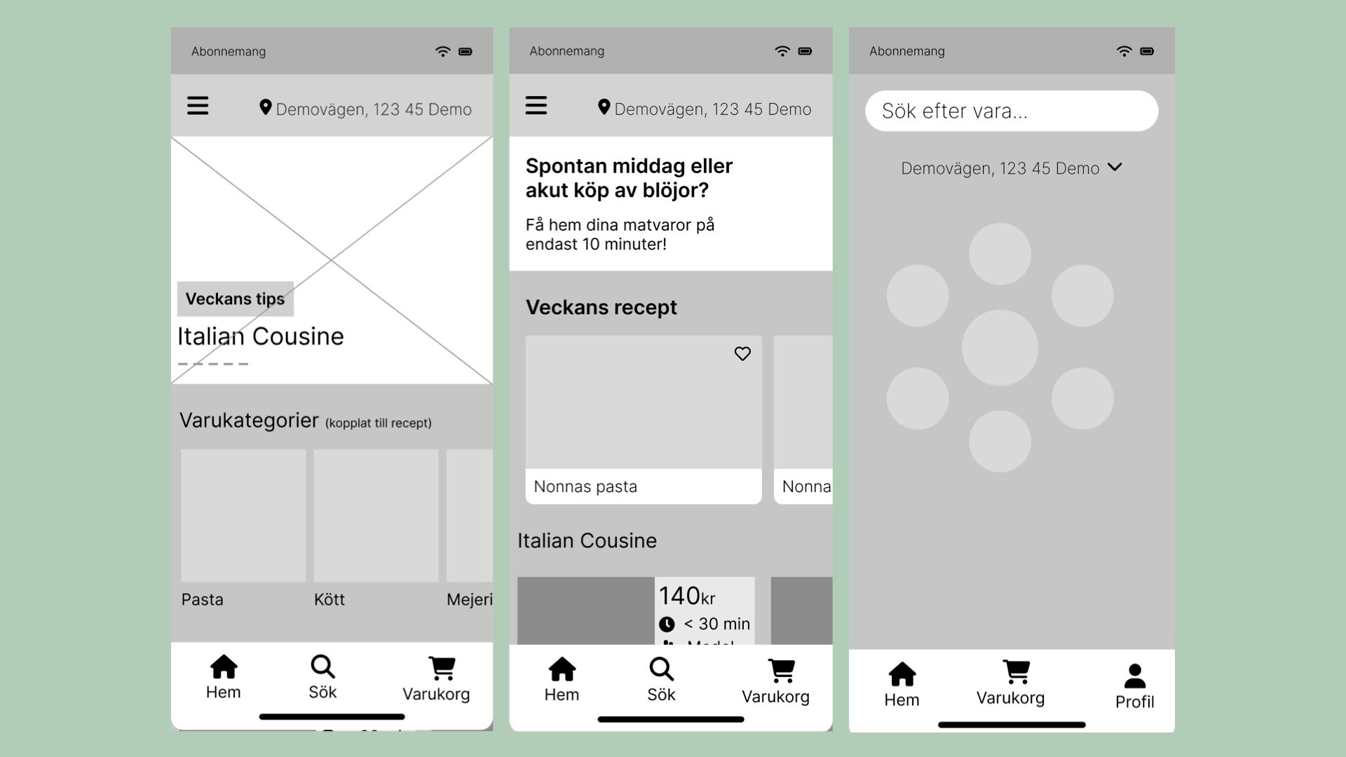
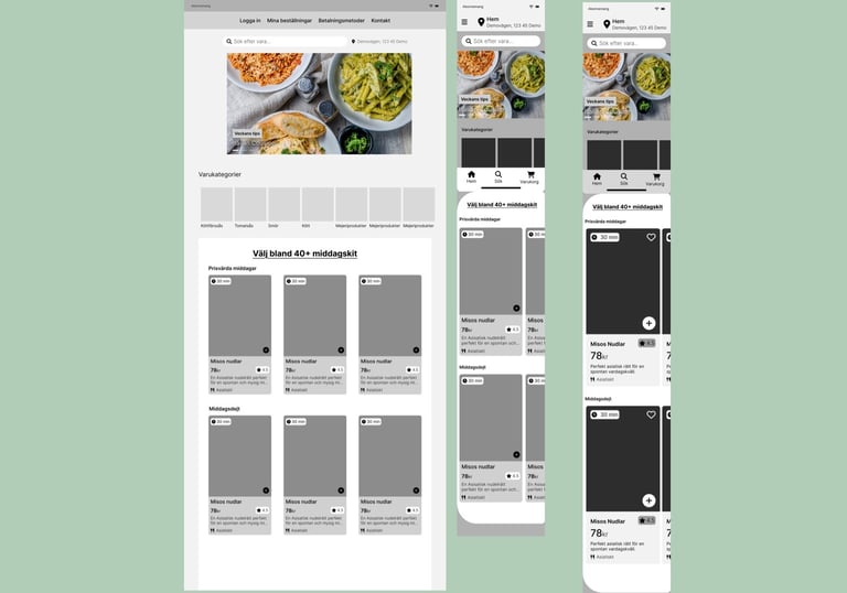
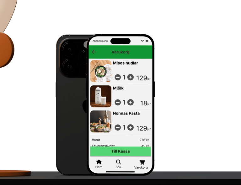
Mockup 3

STYLEGUIDE
Spacing & type scale
I used a 4px spacing system with all margins and padding in multiples of 4px. Small gaps of 4 to 8 pixels group related items, while larger spaces of 16 to 24 pixels separate sections. Touch targets have a minimum size of 48 by 48 pixels to ensure easy tapping. This approach keeps the interface clean and user-friendly. I also ensured the typography follows a clear hierarchy to improve readability.
Components
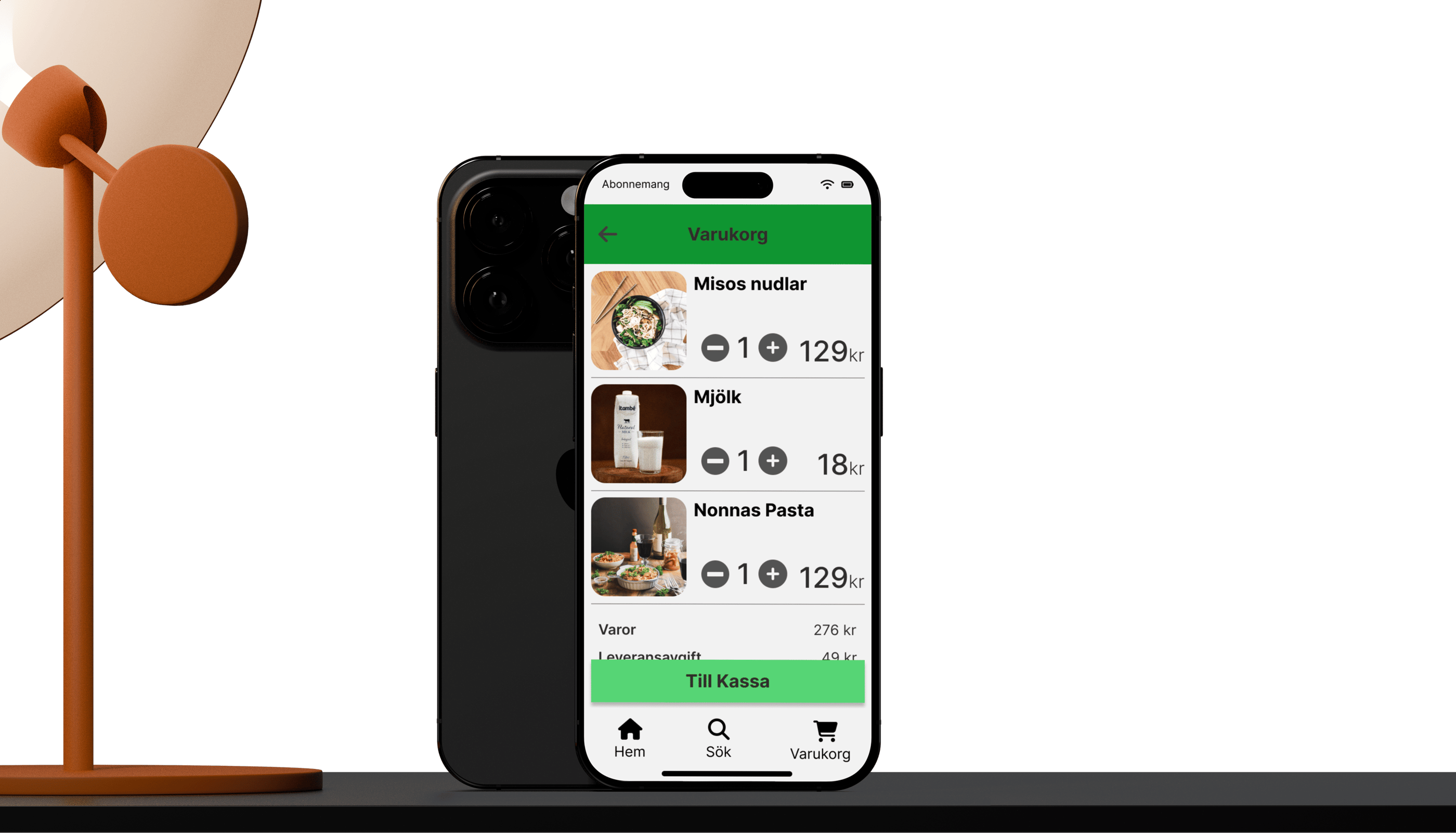
To create a consistent and efficient user interface, I designed a set of reusable components. These components include buttons, product cards, headers, and navigation bar, all designed to maintain visual harmony and improve usability throughout the product.
Typeface
I chose Inter for its modern, clean look and excellent legibility across digital platforms. Its flexibility with more than nine different font weights enables a clear visual hierarchy and consistent branding across various applications. Additionally, I avoided using more than one typeface to maintain visual coherence and simplicity, preventing any distraction or clutter in the design. Using a single versatile typeface like Inter helps create a unified and professional appearance
Brand & Colors
Green was chosen as the company color because it conveys calmness and reliability, creating a feeling that the food will be delivered on time in an environmentally friendly way. The color palette uses shades from 100 to 900 to narrow down the design choices and create a clearer and more consistent design. To ensure accessibility and readability, we secured at least two contrast steps between color choices, for example using Grey 700 and Grey 900. This approach helps maintain a clear visual hierarchy and sufficient contrast throughout the design.
The carousel component was implemented to showcase multiple pieces of content in a compact space. It allows users to swipe or click through items easily. This helps present featured content or products in an engaging, user-friendly way while keeping the interface clean.
Carousels
Design choices
My design is simple and minimal, focusing on clarity and ease of use. By cutting out unnecessary elements and emphasizing key features, users can navigate the app easily and place orders quickly. I wanted the look and feel to be safe and professional, welcoming to all ages. I chose green as the brand color because it feels calm and reassuring. This clean, straightforward interface makes every interaction smooth and intuitive.
Mobile first and minimalistic
Accessibility
To improve readability and usability on mobile, I set body text to at least 16 pixels, following a best practice many designers use based on WCAG 2.2 guidelines. I also made sure buttons and touch targets are at least 48 by 48 pixels to make tapping easier and more accurate. Additionally, I kept product cards within recommended width limits to create a clear and simple layout. These choices help make the express food delivery app easier and more pleasant to use.
What's next?
User testing & interviews
Because of the tight deadline and the project being fictive, no user testing or interviews were done. For a real project, I recommend conducting user tests and stakeholder interviews to gather feedback and improve the UI.
Productcards
I noticed the product cards are somewhat too tall, particularly on phone screens. Reducing their height would improve usability and create a cleaner, more balanced layout. Additionally, I would ensure the design follows WCAG guidelines to boost accessibility and overall user experience.
Continue working on the concept
Since this project was very open-ended, it was challenging to develop a clear and strong vision. Partly because the idea of a 10-minute bike delivery felt somewhat unrealistic, along with a few other factors. Still, the process was rewarding and enjoyable, offering valuable learning and creative opportunities.
Project takeaways
Applying Core UI Principles
Working on this project strengthened my confidence in applying core UI principles like clear visual hierarchy and consistent spacing to create scalable designs.
My first full UI design project
This project taught me the value of staying curious and open-minded through the whole process and the importance of a beginners mindset.
Aiming for “good enough” early on helped me iterate faster and maintain creativity without getting stuck in perfectionism.